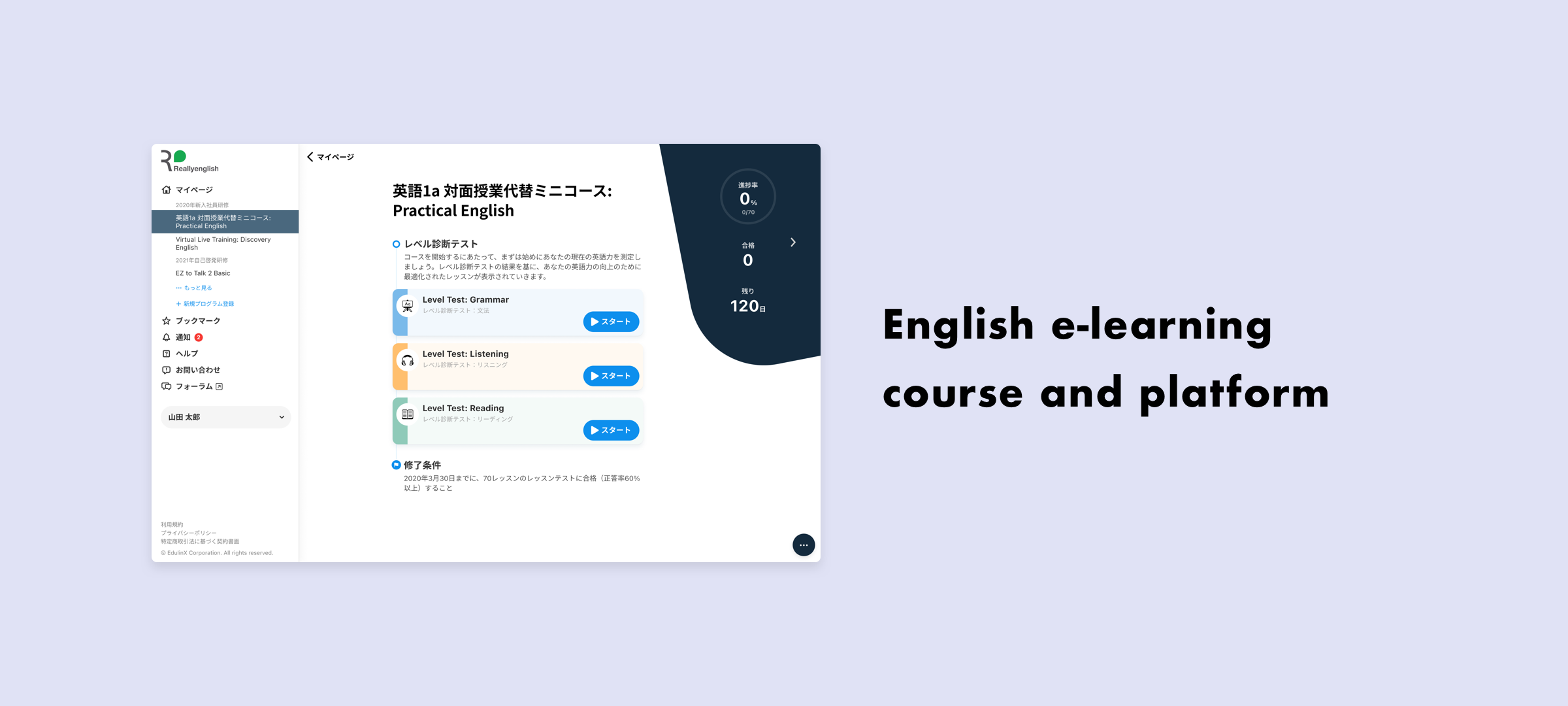
English E-learning Course & Platform
Content upgrade and UI renewal of an English e-learning system.
Designed in 2021-2023, and is scheduled to be released in phases in 2025-2026
Japan
Background
This project was for Reallyenglish, a widely used English e-learning service in Japan. The platform provides structured online English courses tailored to learners at different proficiency levels, used by both individuals and corporate clients.
The redesign project had two key objectives:
Enhance learning effectiveness through richer, more interactive content.
Revamp the UI/UX to improve usability, accessibility, and visual appeal across desktop and mobile devices.
I worked closely with the content strategy team to visualize and deliver improvements in both content and product experience. As the only designer in the company, I led the entire design process, from strategy to execution.
Due to unforeseen development delays and internal resourcing challenges, I also took on product management responsibilities, defining the implementation roadmap and setting up agile practices to facilitate smoother progress.
My Responsibilities
Define the project scope and align stakeholders
Redesign the information architecture based on a complex legacy backend system
Unify the user experience across desktop and mobile platforms
Improve usability for learners and administrators
Design a new visual style, maintain a reusable UI component system
Collaborate with the content team to reimagine the learning activity formats
Manage the product development roadmap and coordinate with engineers
Establish agile processes to ensure iterative development and regular feedback loops
Project Objectives
1. Content Enrichment
The content team wanted to make lessons more engaging, with richer media and interactive formats. I co-developed prototypes for:
Drag-and-drop sentence reordering tasks
Pronunciation practice exercises
Responsive grammar/listening/reading modules
Each activity type was designed to be intuitive and visually engaging, while also technically feasible for LMS integration.
2. UI/UX Redesign
The old interface was outdated and inconsistent across platforms. I proposed a new IA and visual design system with the following improvements:
Clearer navigation and course structure
Responsive layouts for seamless use on desktop, tablet, and mobile
Simplified progress tracking
A unified design language with modular components for scalability
Process & Deliverables
Conducted a usability audit of the legacy platform
Defined core user flows: onboarding, lesson access, test completion, and progress review
Created wireframes and high-fidelity mockups
Developed a cross-platform UI kit and design system
Wrote and prioritized the product backlog for implementation
Challenges
The backend structure was rigid and required compromises in some user flows.
Limited development resources led to slow progress, which I helped mitigate by implementing tighter cross-functional collaboration.
As both designer and PM, I had to balance design quality with technical feasibility and delivery constraints.
Outcome & Impact
A refreshed and unified learning interface that improved navigation, clarity, and visual appeal
A modernized learning experience with interactive and mobile-friendly activities
A clear and scalable design system that engineers could reuse across modules
Improved learner satisfaction and reduced support requests (qualitative feedback from client institutions)
While development was rolled out in phases, the newly designed system laid a strong foundation for long-term product evolution and content expansion.
Reflection
This project was a significant step in my career, not only in UI/UX design but also in product ownership. Taking initiative beyond my designer role helped drive the project forward and strengthen alignment between design, engineering, and content strategy.
Great design starts with understanding user needs, but real impact happens when you also help teams deliver it, step by step.
Case Study 1
Cross-Device Information Architecture & Responsive Layout
Problem
The desktop and mobile versions of the learning platform had inconsistent navigation structures and feature sets, causing confusion for students. Some key functionalities were only available on desktop, and navigation patterns differed significantly between platforms.
Goal
Unify the experience across devices to:
Reduce user confusion
Ensure mobile users have access to all essential features
Improve the learnability and usability of the system on any device
Design Solutions
Redesigned the information architecture to ensure consistency between desktop and mobile.
Enabled edge-expanding navigation on desktop, even within course pages, users no longer need to return to the homepage to access top-level features.
Aligned visual and interaction patterns on mobile and desktop versions, especially on course pages.
Ensured that almost all desktop features were accessible from mobile, with responsive layouts and simplified UI.
Outcome
Reduced user confusion and support requests.
Improved student satisfaction with the mobile experience.
Set a foundation for unified feature development across platforms.
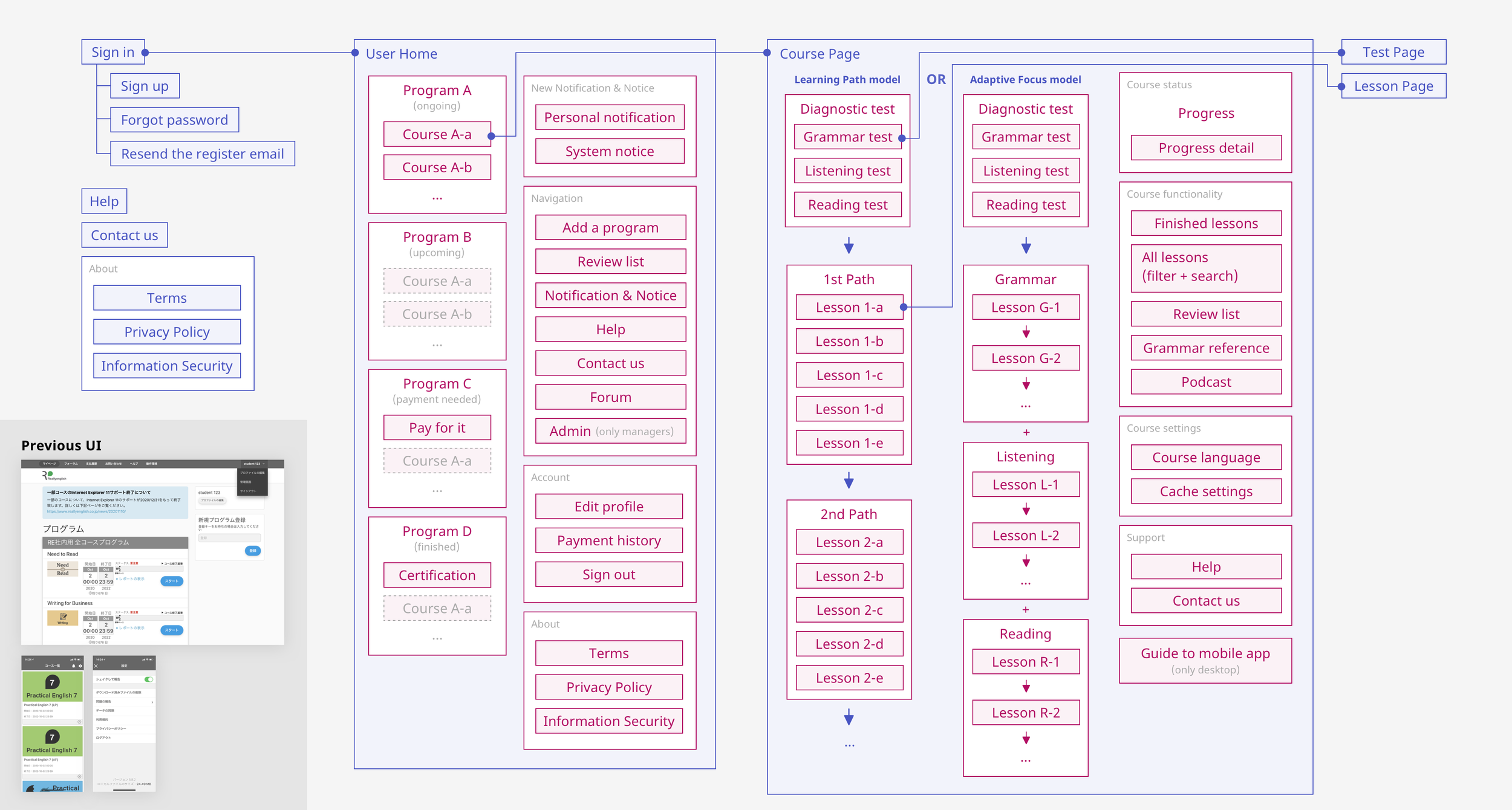
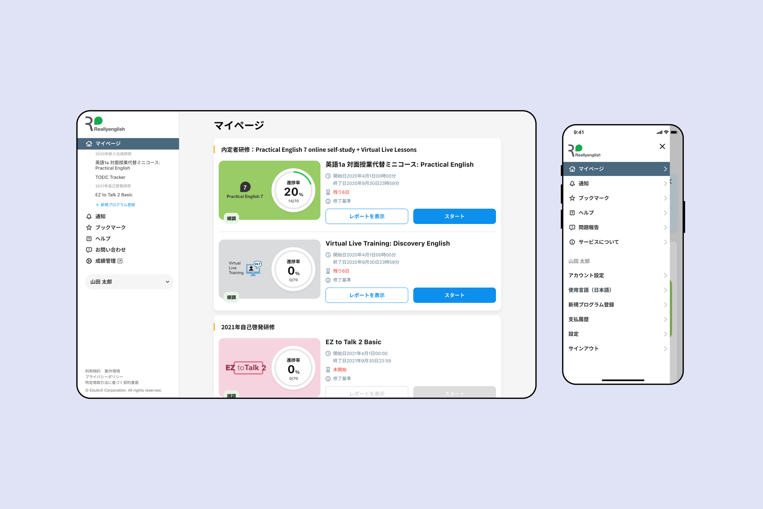
Based on the functionality hierarchy of the old system, I made some changes to make it clearer and more consistent across desktop and mobile apps.
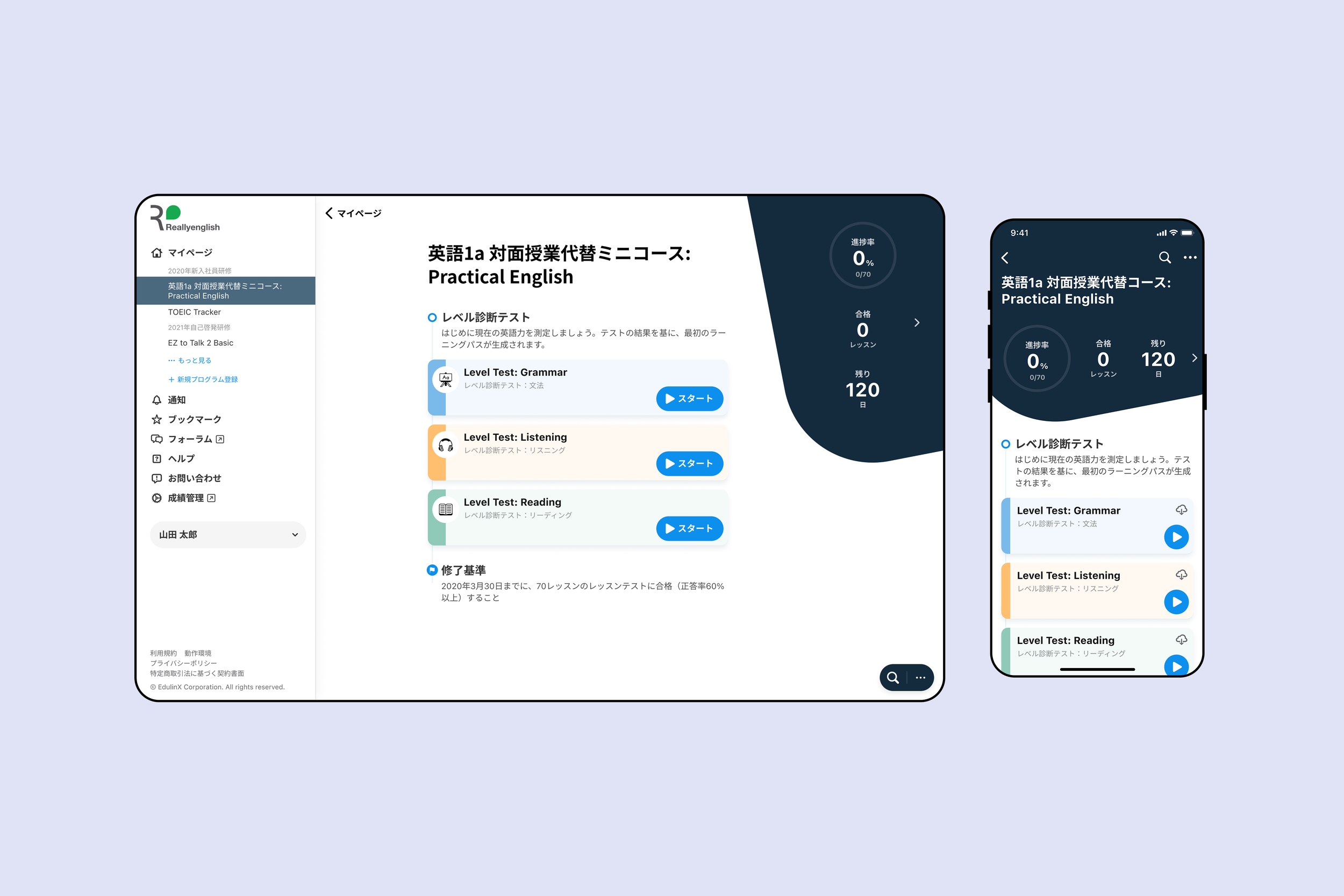
The navigation on the desktop can be expanded from the edge, even on the course pages. Users don’t have to go back to the top page to access functions on the top level. I enhanced the consistency of the course page design between desktop and mobile.
The functionalities on desktop are almost accessible from the mobile app.
Case Study 2
First-Time UX and Onboarding Guidance
Problem
The onboarding experience for new users was a 5-screen walkthrough that overwhelmed learners before they even began. Many users skipped it or failed to retain the information, leading to confusion when navigating the system for the first time.
Goal
Create an onboarding experience that is:
More contextual
Easier to understand
Less intrusive
Design Solutions
Replaced the multi-screen walkthrough with in-line guidance:
Show welcome messages and short tips when users arrive at key pages.
Provide step-by-step instructions only when needed (e.g. before starting or after completing a task).
Tailored instructions to the specific content group or learning activity.
Outcome
More intuitive first-use experience.
Reduced friction for new learners.
Improved first-session engagement.
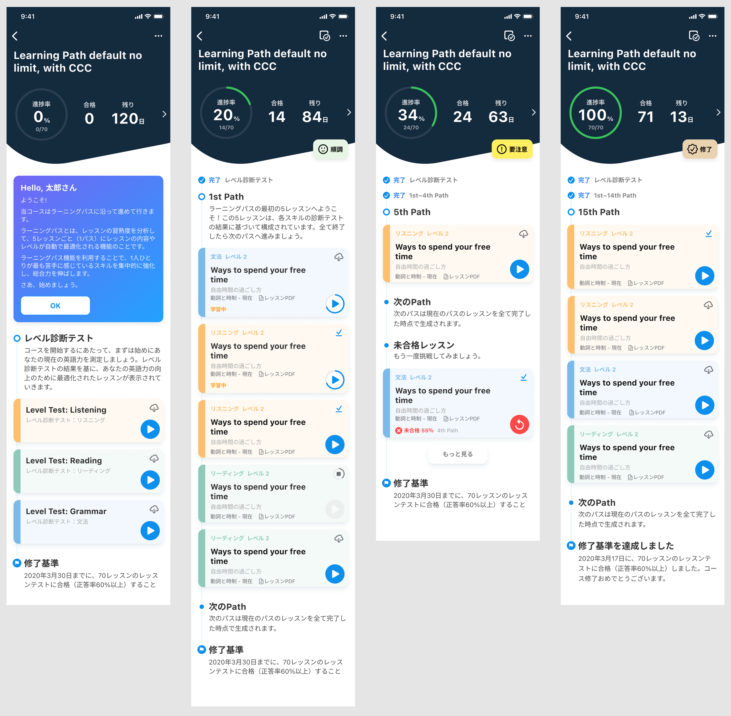
Show a welcome message and inlined instructions for each group of content.
Case Study 3
Auto Pre-Download Feature for Offline Study
Problem
Many users, especially university students and employees, studied while commuting, often without a Wi-Fi connection. Because lesson data could not be streamed, users had to manually download each lesson, which was cumbersome and easy to forget.
Goal
Improve offline usability by:
Reducing the need for manual downloads
Preventing situations where users can't study due to missing lesson data
Design Solutions
Introduced a new auto pre-download feature on mobile:
When users finish a section of lessons, the next set is automatically downloaded over Wi-Fi.
Redesigned lesson cards to:
Display lesson title, status, download/study state, and progress
Clearly indicate whether a lesson is ready to use offline
Outcome
Reduced user frustration and dropped sessions due to lack of data.
Encouraged continued learning in offline environments (e.g. commuting).
Simplified the user experience while preparing for future lessons.
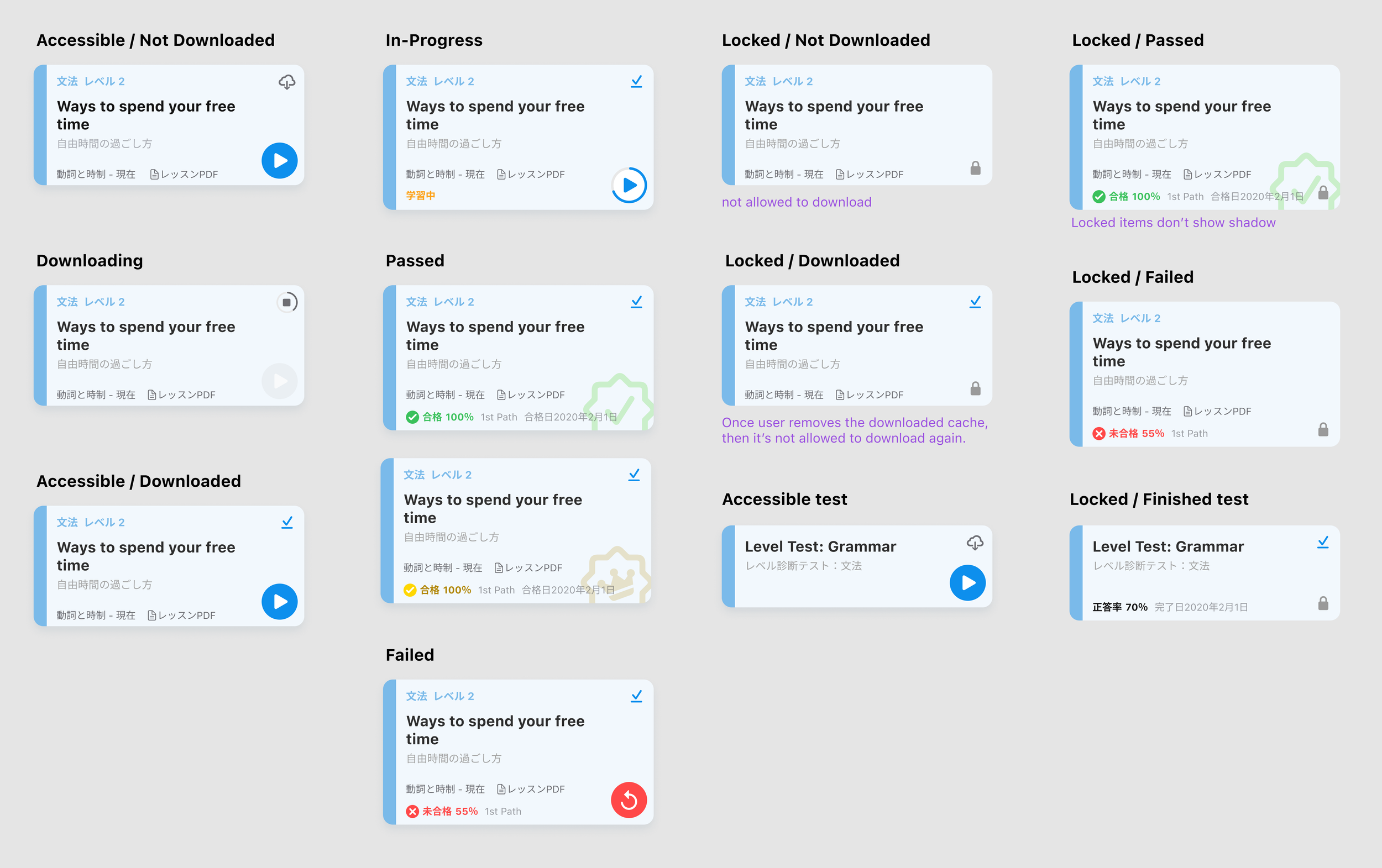
I redesigned the lesson cards to show required lesson information and download/study status, and progress.