Defining an App Store
How might we help Android users find and manage apps more easily?
May - Aug 2015, China
WANDOUJIA 豌豆荚 5.0
Wandoujia (豌豆荚) was a leading Android management tool and app store service in China. In 2013, the year I joined the company’s product design team, it held the largest market share in the Chinese Android ecosystem.
※ At that time, Google Play was not accessible in China, so Android users relied on third-party app stores for downloading and managing apps.
This case study focuses on the information architecture redesign and the foundational UI system of Wandoujia Version 5, a pivotal release that marked a major shift in the company’s product strategy. The redesign simplified the app into a focused app store and management tool, discarding previously added, non-core features.
I served as the lead product designer, working closely with a UI designer, business strategy product managers, Android engineers, and the user research team.
The redesign work, including the new information architecture and visual design, was completed in 2 months, followed by 1 month of refinement and implementation. After several gray releases, Wandoujia v5.0 officially launched in August 2015.
Background
Leading up to 2015, Wandoujia’s Android app had become increasingly bloated, evolving from a simple app store into an all-in-one platform that included app/game downloads, as well as music, ebooks, and movie streaming. While ambitious, this strategy ultimately failed. Providing multimedia content proved to be resource-intensive and outside the company’s core strengths.
In response, leadership made a strategic decision to refocus on Wandoujia’s original value: helping users discover and manage Android apps.
To support this shift, our user research team conducted studies to identify the core target users and refine their personas. Both the redesign and the marketing strategy were grounded in a deep understanding of these users’ needs and behaviors.
Problem & Project Scope
With over 70 million monthly active users, the redesign of Wandoujia's app would have a significant impact. The previous version suffered from deep and overly complex navigation hierarchies, requiring users to tap through multiple layers just to access core features. Additionally, the app was overloaded with functionalities, many unrelated to app management, leaving users confused about what the app was truly meant to do.
Project Goals:
Remove unnecessary features and refocus on core value: app acquisition and management.
Redesign the experience for discovering and managing apps on users' phones.
Support a modular and backend-configurable UI, enabling updates via backend without requiring a new native release. All UI components needed to be flexible and modular.
Key Metrics:
Average app downloads per user (most influenced by the UI/UX redesign)
New user retention rate
Step 1Simplify the Information Architecture
The project began by streamlining the app’s structure and reducing unnecessary complexity. We sunset some non-core features, such as multimedia content (music, ebooks, movies) and utility tools, which allowed us to reorganize and realign the app’s architecture around its core value proposition.
Wandoujia, at its core, is an app store. That means it should excel at helping users discover, search, access, and manage apps and games efficiently.
One challenge we faced was the inconsistent handling of apps vs. games. Historically, the two were designed and maintained by separate teams, leading to different features and user experiences, even though games are technically applications too. To resolve this, I unified their structure and functionality, while retaining feature differences that were meaningful to users.
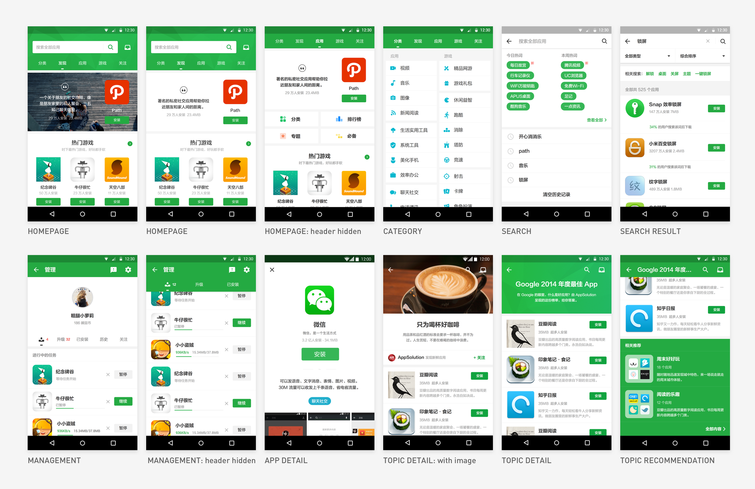
Once the new information architecture was defined, I moved on to redesigning each core feature and interface based on primary user scenarios, ensuring a cohesive, intuitive experience.
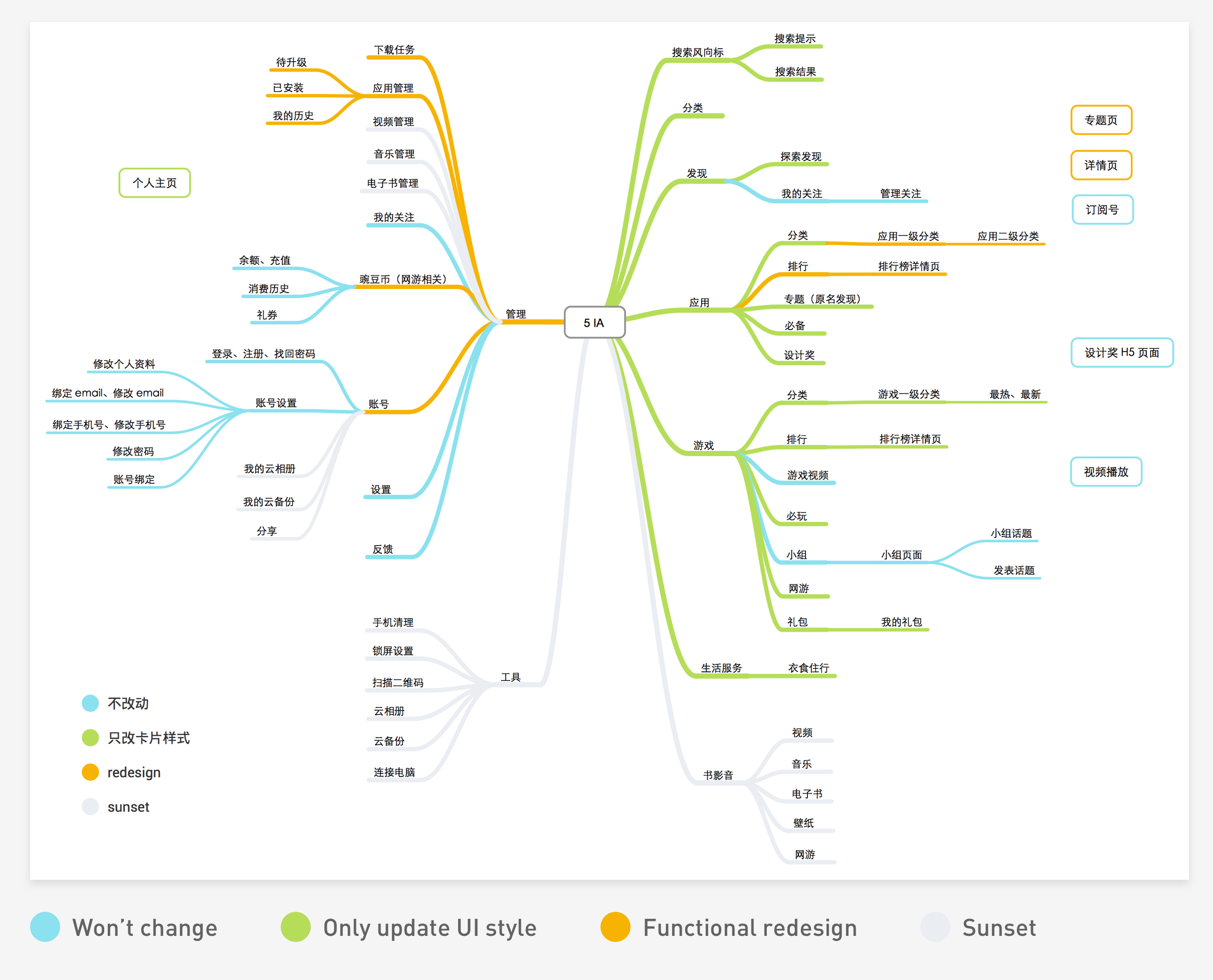
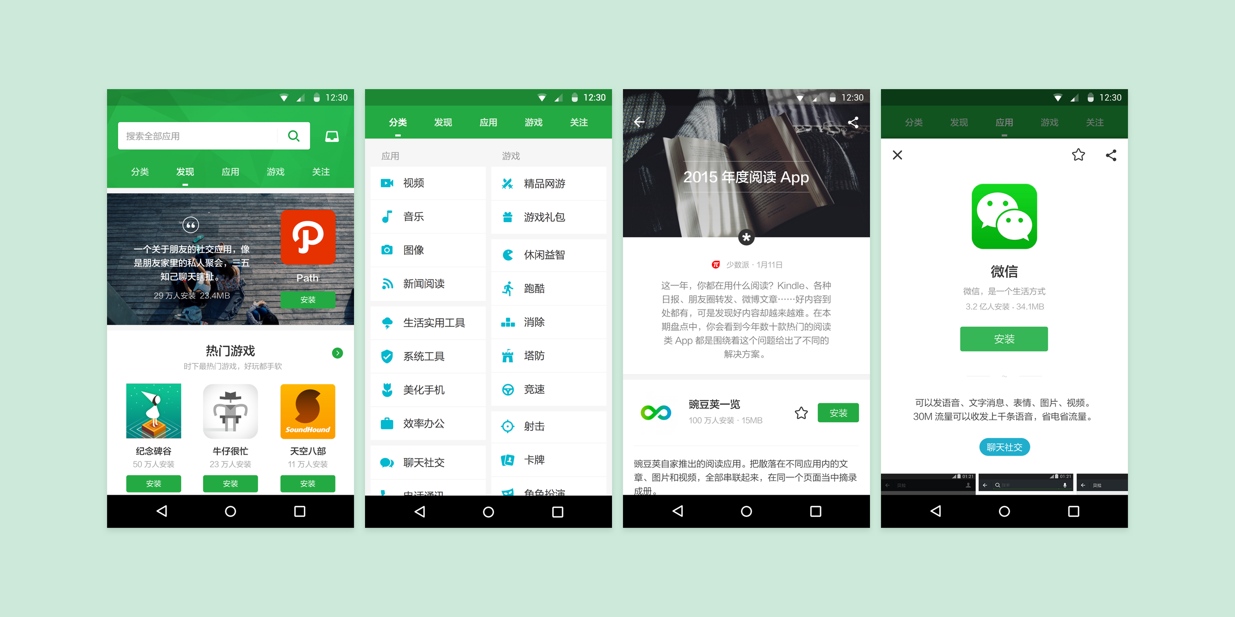
IA of the previous version. We decided to cut off many functionalities.
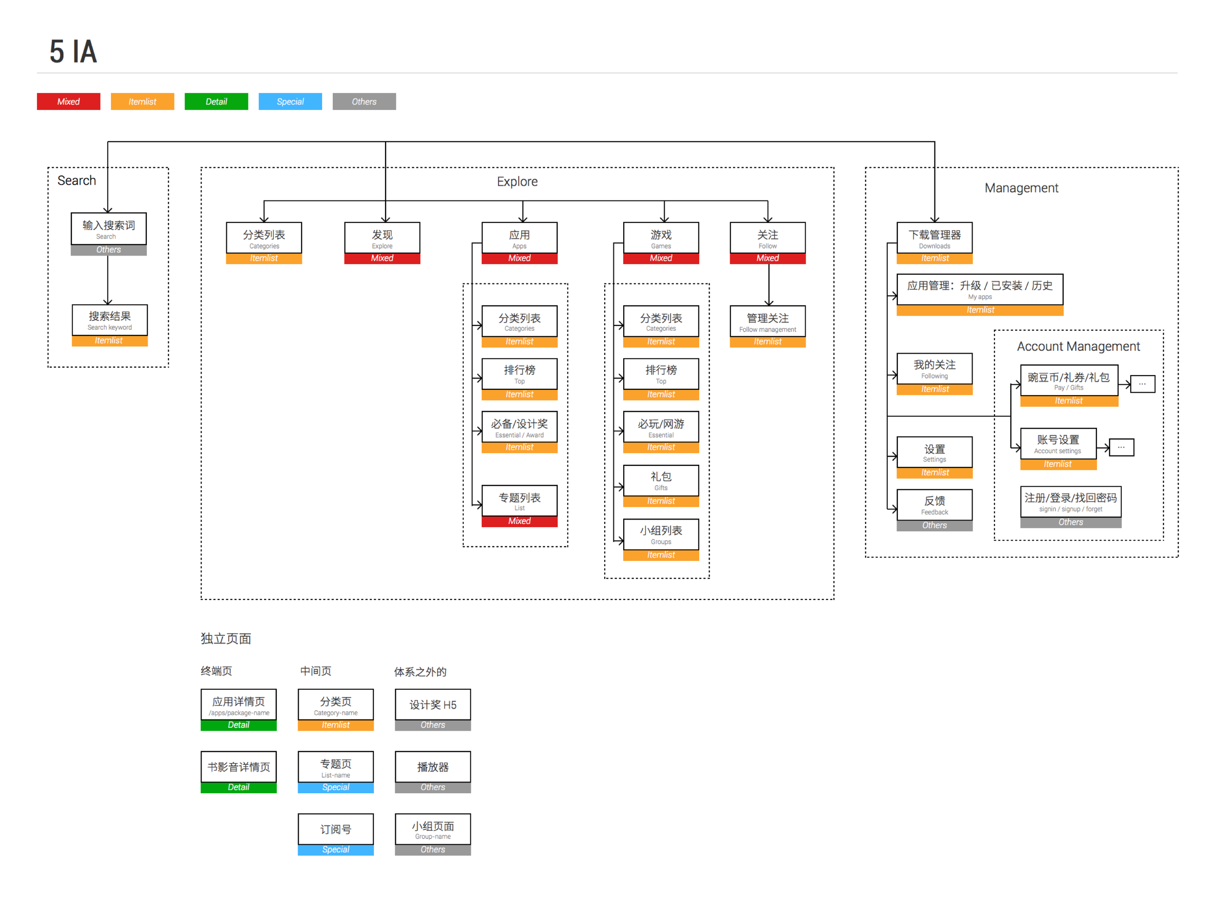
The new IA focuses on how our users discover, search and manage apps/games.
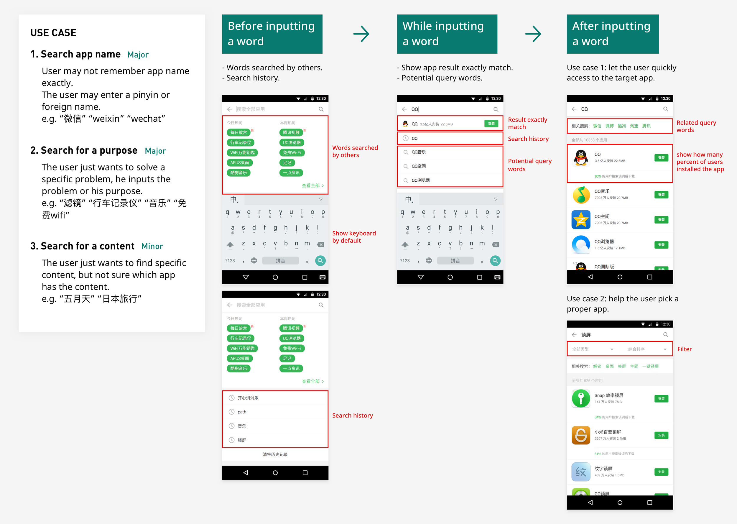
Step 2Understanding How Users Discover Apps
Hypothesis:
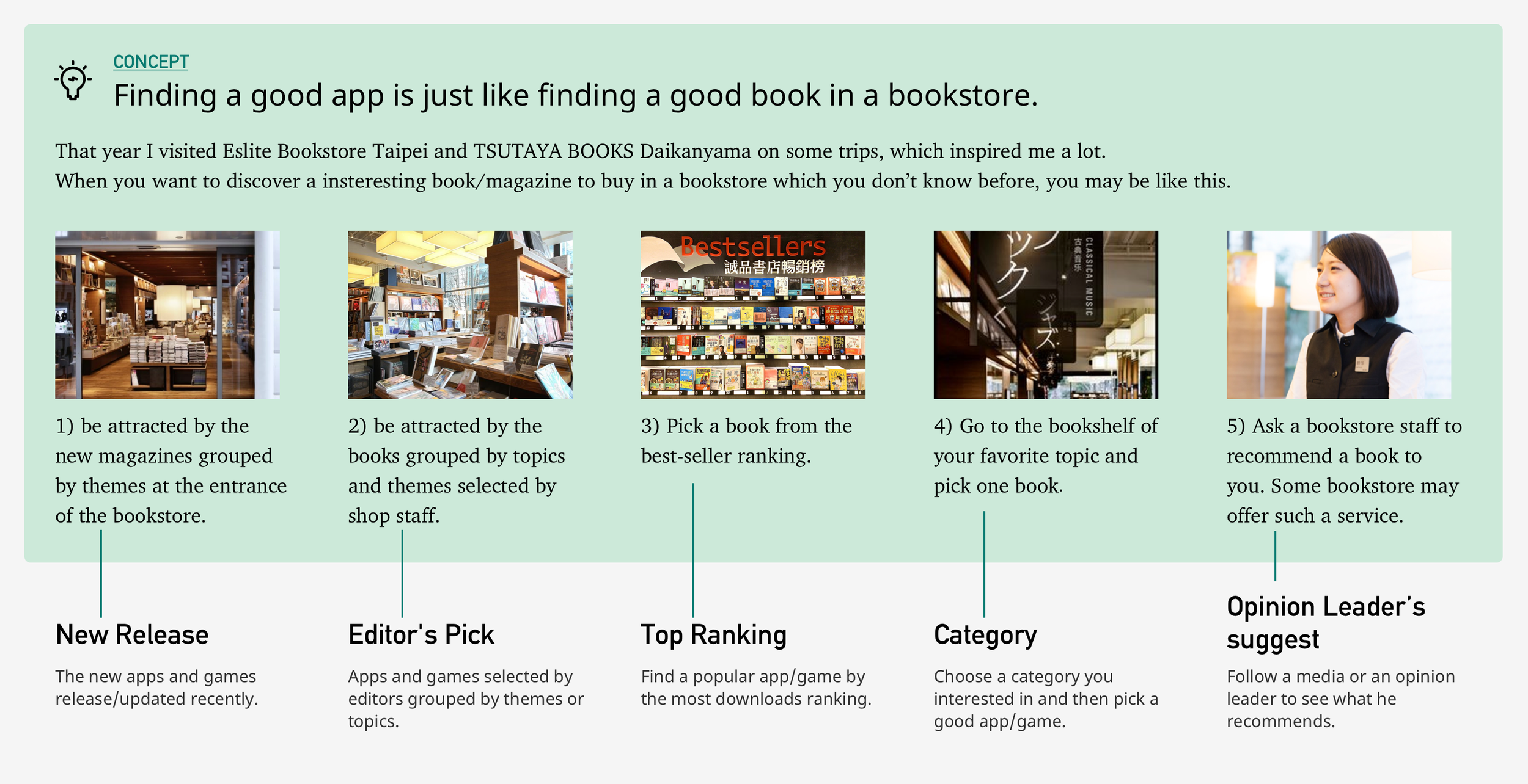
Discovering an app or game is similar to browsing for a book in a physical bookstore, users often explore by genre, theme, or recommendation rather than knowing exactly what they want.
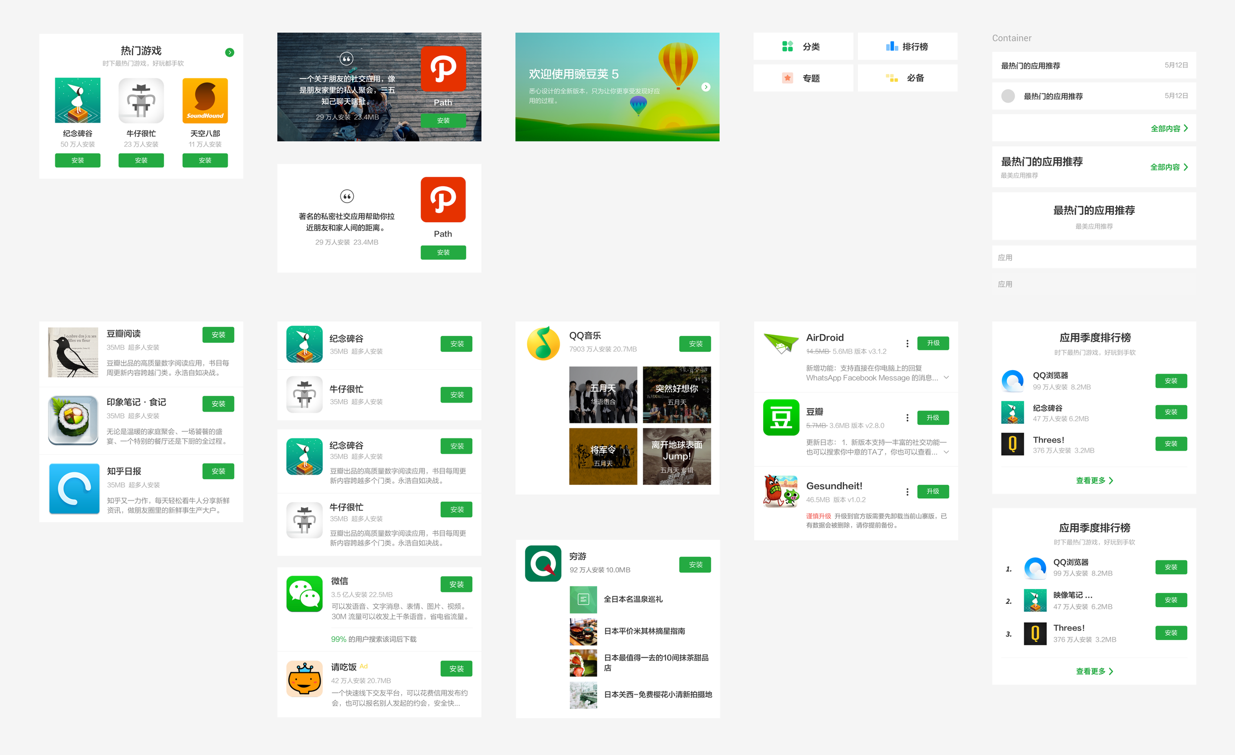
To simplify the user experience, I defined two core item-display layouts that could be applied consistently across the app’s navigation structure. These layout patterns served as the foundation for designing each screen in the discovery flow, ensuring a cohesive and intuitive experience across different user scenarios.
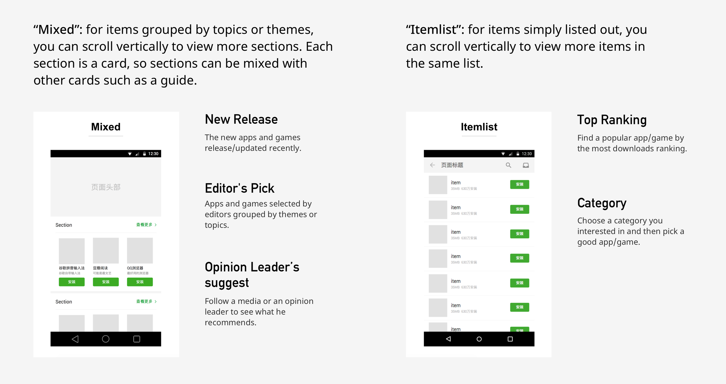
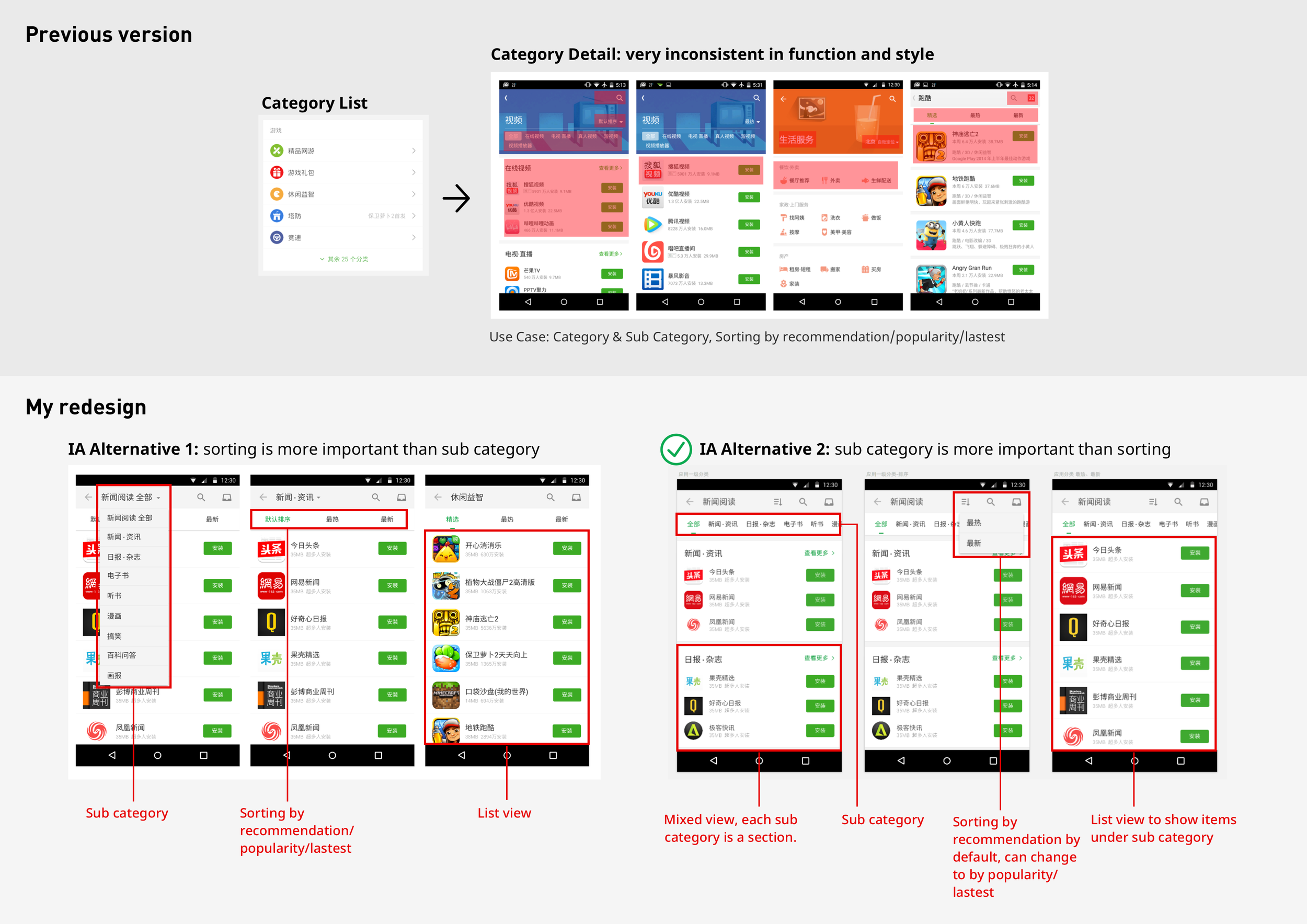
Example: Redesigning the Category Page
Use Case:
A user is casually browsing and selects a category of interest, such as "Photography" or "Casual Games", and then picks an appealing app or game from that list.
The new design emphasizes clarity and ease of navigation, helping users quickly understand the context of each category and explore apps more confidently. Layouts are visually consistent, and content is grouped in a way that mirrors natural browsing behavior.
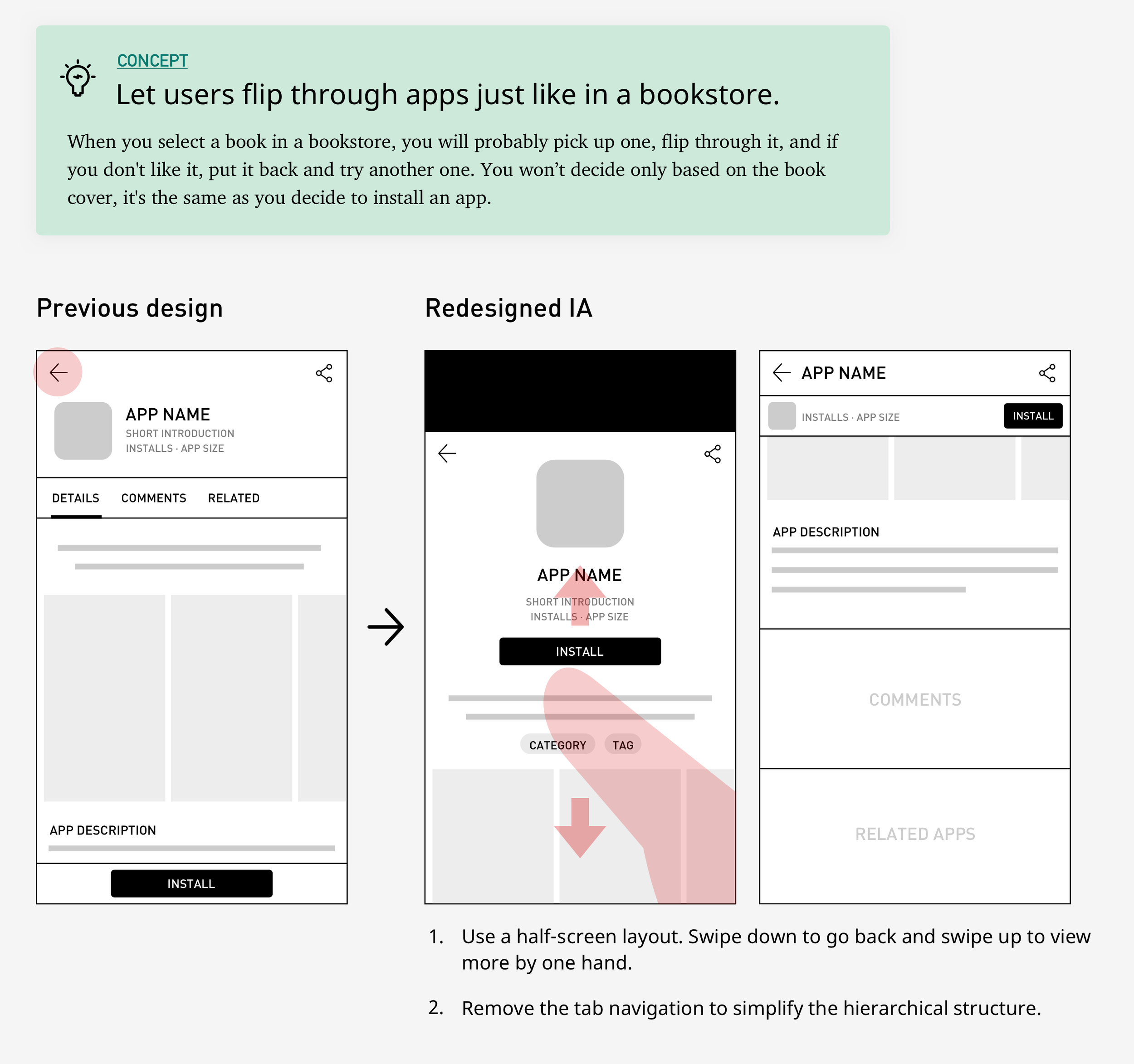
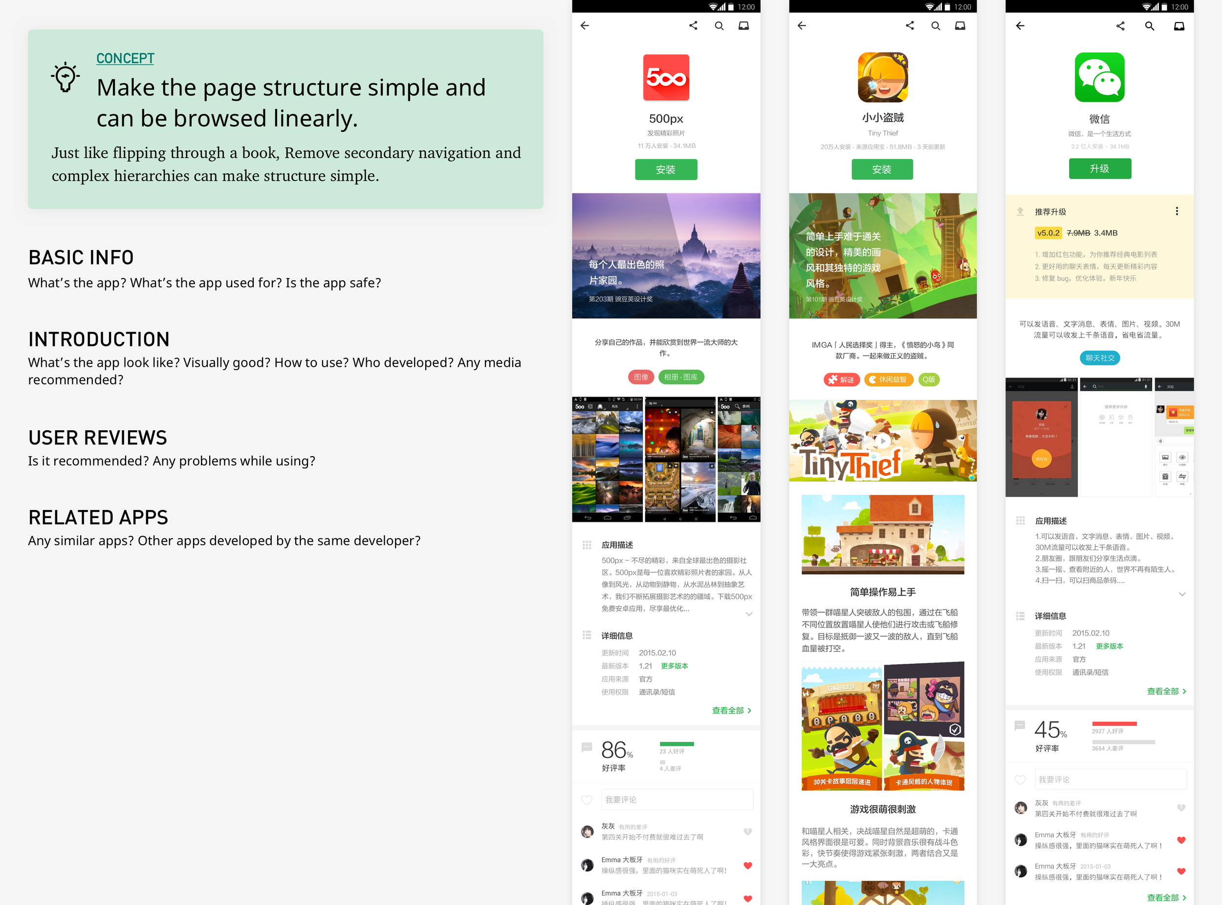
Step 3Redesigning the App Detail Experience
Use Case:
When users find an app that looks interesting, they tap to view more details. If it doesn’t meet their expectations, they should be able to easily close the page and continue browsing.
While an advanced personalization algorithm could have helped prioritize relevant apps at the top of listings, this was out of the project’s scope. Instead, I proposed a design solution that supports rapid exploration, allowing users to view, dismiss, and move on to the next app quickly.
Key Design Solution:
“Quickly-Leave” Interaction
Introduced a half-screen modal for app details.
Enabled a swipe-down gesture to close, allowing users to seamlessly return to the list without mental or visual friction.
At the time (2015), this pattern wasn’t yet widely adopted, but it later became a common standard in mobile UI design.
Results from A/B Testing:
The new interaction significantly increased page views and, in turn, app downloads.
Users explored more apps in a single session, improving engagement and discoverability.
Design Decision: Sorting vs. Sub-Categorization
In the redesign, I explored two alternative ways to help users refine their app discovery:
Sorting by popularity or recency
Useful for users who want what's trending or newly released.Sub-categories based on user intent or scenarios
More effective for users looking for apps that serve a specific purpose, e.g., “Photo Editing,” “Workout Trackers,” or “Kids’ Learning.”
Ultimately, I prioritized sub-categories as the default filter, as they aligned more closely with users’ goals and helped narrow down their choices based on real-world use cases.
Step 4Other Design Improvements
In addition to discovery and app detail pages, I also redesigned other key flows, including:
App Search – Optimized the search interface to return faster and more relevant results, with clearer categories and keyword suggestions.
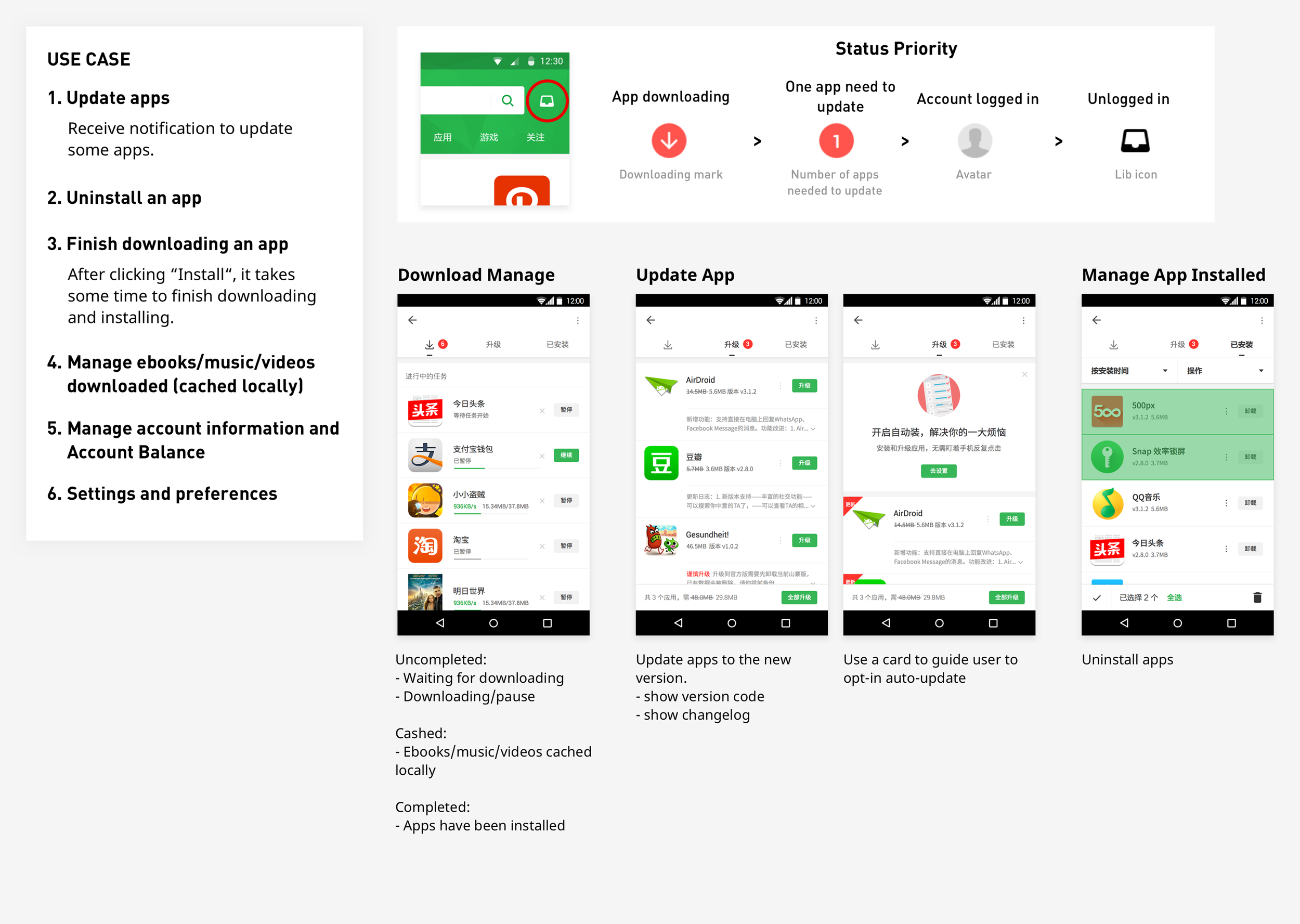
App Management – Streamlined the experience for users to view, update, and uninstall installed apps, with a more intuitive layout and feedback system.
These updates helped reinforce Wandoujia's position as both a powerful app store and a reliable app management tool.
Step 5Visual Design & UI Component Library
To ensure consistency across the redesigned experience, I collaborated with our UI designer to:
Develop a unified visual language across all platforms (Android, desktop web, etc.)
Maintain a scalable UI component library that supported modularity, enabling backend-driven content updates without needing new native releases.
The design system covered layout grids, typography, color schemes, button styles, and reusable components, ensuring visual and interaction consistency throughout the app.
Impact of the Redesign
The full redesign and engineering rebuild were completed in just 3 months, thanks to intensive collaboration and overtime across teams. In August 2015, we launched a series of 5% gray releases to test the new version against key metrics before a full rollout.
Key Outcomes:
Significant increase in average app downloads per user
This was largely attributed to the redesigned app detail view and the new swipe-to-close gesture, which made browsing faster and more fluid—leading users to explore and download more apps per session.Stable performance across other core metrics
Metrics like retention and crash rate remained consistent with the previous version, showing that the redesign didn’t negatively impact overall stability or user behavior.Positive reception from users and media
The updated look and feel, combined with a refreshed brand identity, received praise from both tech media and end users.
One particularly meaningful moment for me was hearing from new acquaintances—years later—who remembered and complimented the Wandoujia v5.0 update from back when it launched.
Media reports: