Lessons Learned from Designing a Complex System
Is the problem we are trying to solve a real problem?
2019, Japan
This was a project that I intentionally stopped midway through the design process. Although the project didn’t reach completion, it taught me valuable lessons that I want to share here.
It’s not uncommon to be assigned a “big” redesign project, one aimed at replacing an existing system that’s seen as outdated, hard to maintain, or simply lacking a modern look. The project typically comes with ambitious goals, all defined from the internal team’s perspective rather than the users’. You’re asked to create a sleek, new system to fulfill a wide range of objectives. As the project moves forward, the scope keeps expanding, the complexity grows, and eventually, it becomes unmanageable. In many cases, implementation stalls or never happens, especially when the broader business context shifts or the original goals prove unrealistic.
To avoid this kind of outcome, it’s crucial to identify a feasible path forward, whether that means narrowing the scope, validating or disproving assumptions, shifting direction, or even deciding to stop entirely.
This case study demonstrates how I challenged the initial hypothesis, showed it was flawed, and decided to change the project's direction before more time and resources were wasted.
Background
This project was for TakeMe Pay, a B2B service that provides tools for merchants in Japan to accept a wide range of payment methods, both online and offline, from domestic customers as well as international travelers.
In line with a new company strategy, we needed to expand the features of the admin system. However, the existing system was built on an outdated technical framework, making it difficult to maintain and scale.
The goal of this project was to redesign and rebuild the admin system to improve the business user experience and support new strategic initiatives, such as enabling reseller roles and streamlining the online application process.
My role and design process
As the sole designer on this project, my responsibility was to design the user flows and interfaces for the new system, tailored to the needs of different user roles, based on a deep understanding of the business model and each role’s specific workflows.
I approached the design process in the following steps:
Identify supported user roles
Define how many user roles the system needs to support and their access levels.User interviews
Conduct interviews with users from each role to understand their workflows, needs, and goals.Define key tasks and functionality
Based on personas and user journey mapping, identify the essential tasks and core functionalities for each role.Design role-based navigation
Create a navigation system that allows each user role to complete their tasks efficiently and without confusion.Design key UX flows
Develop the user experience flows for the most important functions, balancing system consistency with the unique needs of each role.Validate with low-fidelity mockups
Test the key functionalities using low-fidelity prototypes to gather early feedback.Design supporting features
Build out designs for additional features to support both common and edge use cases.
Understanding User Roles
Under the company’s current business model, our internal sales team reaches out to potential restaurants to encourage them to adopt our payment solution. Both the contract and onboarding processes are handled through paperwork. Once onboarded, restaurant staff (Role #1) use an online dashboard to view payment and payout data. Meanwhile, our internal sales team uses a separate dashboard to manage merchants and review transaction details.
In line with the company’s new strategy, we identified four distinct user roles. While Roles #1 and #4 remain central to our operations, we needed to newly support Roles #2 and #3 to enable business growth.
#1 Business Users:
Restaurant or merchant staff who use the dashboard daily to confirm payment and payout data.#2 Applicants (Potential Business Users):
Users who apply for our services online instead of through manual paperwork.#3 Resellers:
Third-party agents who onboard new merchants and check their own payout data.#4 Internal Sales Team:
Employees who manage merchants and resellers and review overall sales data.
Hypothesis
Given the four user roles, I anticipated that the scope of this redesign would be extremely large. The existing system's outdated architecture made it difficult to extend or restructure, and integrating new user roles would have required major changes to the information architecture, something neither elegant nor technically feasible without significant investment.
Adding to the challenge, there was a high-level expectation from management to deliver a dashboard experience comparable to Stripe, both in functionality and polished front-end interactivity. This would clearly require substantial design and engineering resources.
To ensure that this level of investment would be justified, I considered the potential impact. I concluded that such an upgrade would be worth pursuing only if it could significantly increase the desirability of our solution among merchants, ultimately driving more adoption.
Based on that, I framed the core hypothesis for the project:
Improving the user experience of the dashboard system will increase both merchant desirability and internal team efficiency.
Understanding Internal Sales and Business User Workflows
Our company operated with a small internal sales team. To begin my research, I conducted one-on-one interviews with each salesperson to understand their day-to-day workflows. I then asked for their assistance in reaching out to some of our merchant partners, which allowed me to visit their shops and interview both shop managers and frontline staff.
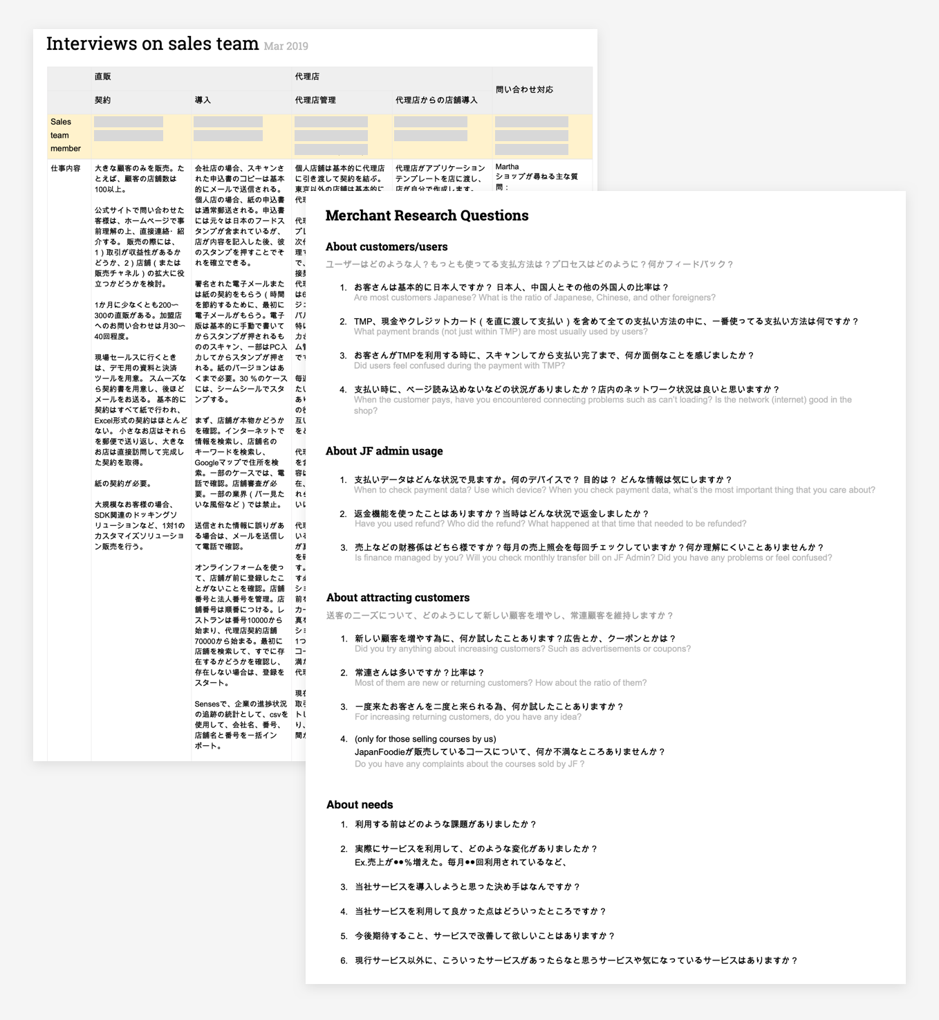
Interview questions and notes
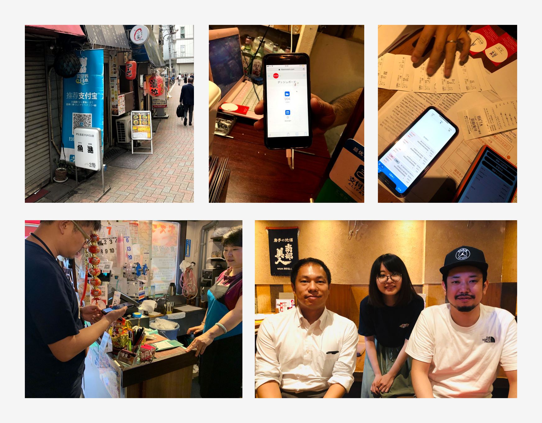
Visit and interview merchant managers and shop staff
Sales Team Workflow
From the interviews, I learned that much of the sales team's work was still reliant on paperwork. Once a merchant manager agreed to use our payment solution, they had to complete a paper-based application form (申し込み), which included detailed shop information and bank account details.
After the application was reviewed and approved, the shop received a physical starter kit by mail. This kit included items such as QR code stands and stickers—each with a unique QR code tied to that specific shop. When customers were ready to pay, they scanned the QR code, which took them to the shop's dedicated payment page.
Merchant Workflow
Shop managers and staff used the dashboard to verify that a payment had been completed and to review transaction data for the day or a specific time period.
From my interviews with both internal salespeople and merchant users, I identified several key pain points and areas for improvement:
Heavy paperwork:
The onboarding process remains paperwork-heavy, largely due to the requirement for official signature stamps (印鑑), which makes digitization difficult.Inefficient payment confirmation process:
Some shop staff have to confirm customer payments using an iPad or desktop. In many cases, the shop’s desktop is located at the cashier counter. During table payments, staff must walk back and forth between the counter and the customer's table to verify the payment—leading to inefficiencies.Limited dashboard usability:
The current dashboard homepage offers minimal information. To confirm a payment, staff need to click through multiple pages and reload them. Shop staff suggested the addition of real-time push notifications to streamline this process.Insufficient access control:
While only merchant managers are allowed to view sensitive financial data, the current access control settings are overly simplistic and don’t adequately support this need.
Data Research
In parallel with user interviews, our product manager and I conducted a data analysis using Google Analytics to better understand how the dashboard was being used.
Key findings included:
#1 – Payment History Pages:
Accessed in ~90% of all sessions. This is clearly the most used feature.#2 – Message Pages (Payment Notifications):
Accessed in ~5% of sessions.#3 – Payouts Pages:
Accessed in ~4% of sessions.
We also used the “User Explorer” feature in Google Analytics to track individual user behavior. This revealed that our most active users were checking payment history pages multiple times per day—further reinforcing the importance of optimizing this area of the dashboard.
User Journey of the Payment Solution
Below is an overview of the typical user journey for merchant managers and shop staff—from decision-making to onboarding, and ultimately to achieving operational success with our solution:
Discovery & Sales Outreach:
Merchant is introduced to our solution by internal sales staff.Application & Onboarding:
Merchant completes a paper-based application and receives physical materials by mail.In-Store Setup:
QR code stands and stickers are placed in-store; staff are trained.Daily Use:
Staff confirm payment completion and review transaction data through the dashboard.Performance Tracking:
Managers monitor payout summaries and business trends over time.
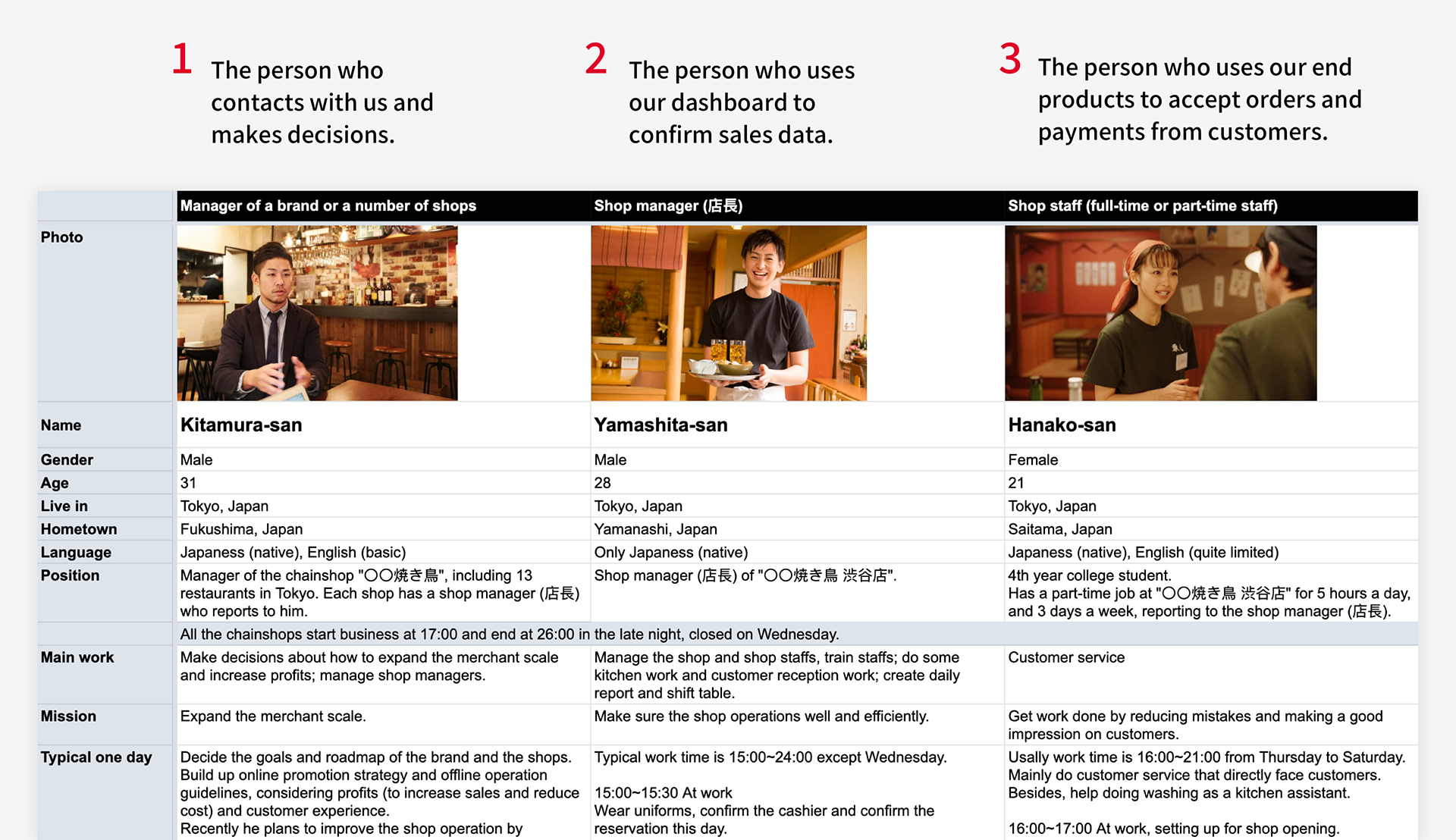
The user personas of staff working in a restaurant. Restaurant staff are our typical merchant users (business users).
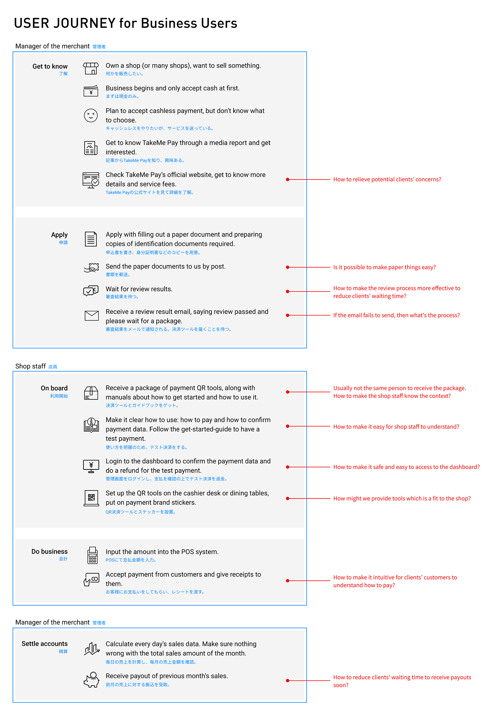
The user journey of the flow from the decision stage, onboarding stage, to business success.
Feature Scope & Design Objectives
Based on interviews and data analysis, I outlined the key features each user role would need in their workflow:
An intuitive dashboard for merchant users (across all three types) to check payment and payout data.
An internal tool for our sales team to efficiently manage merchants and resellers.
[New] Functionality for resellers to manage their incentives and view income.
[New] Online application process to allow potential clients to sign up and onboard easily.
Paper Sketches & Wireframes
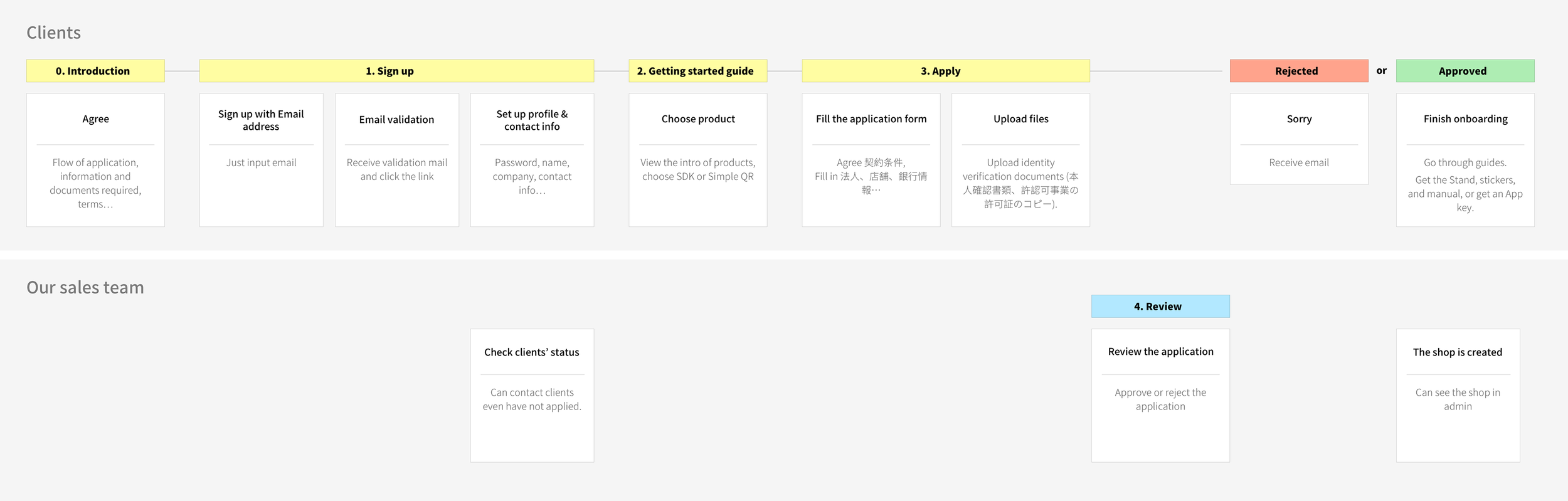
I began sketching wireframes to illustrate the user flow for new merchant onboarding. In this proposed flow:
New merchants would visit the site and submit their business information through an online form.
Our sales team would review the application.
Upon approval, the system would automatically register the merchant, create their accounts, and send them a welcome email.
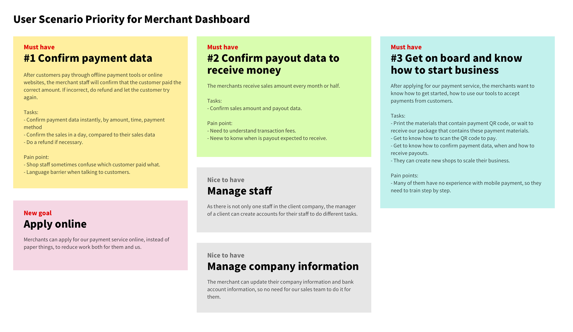
User Scenario Priority
The user flow of applying online. This is a new functionality to the system, and we hope this can replace the paperwork.
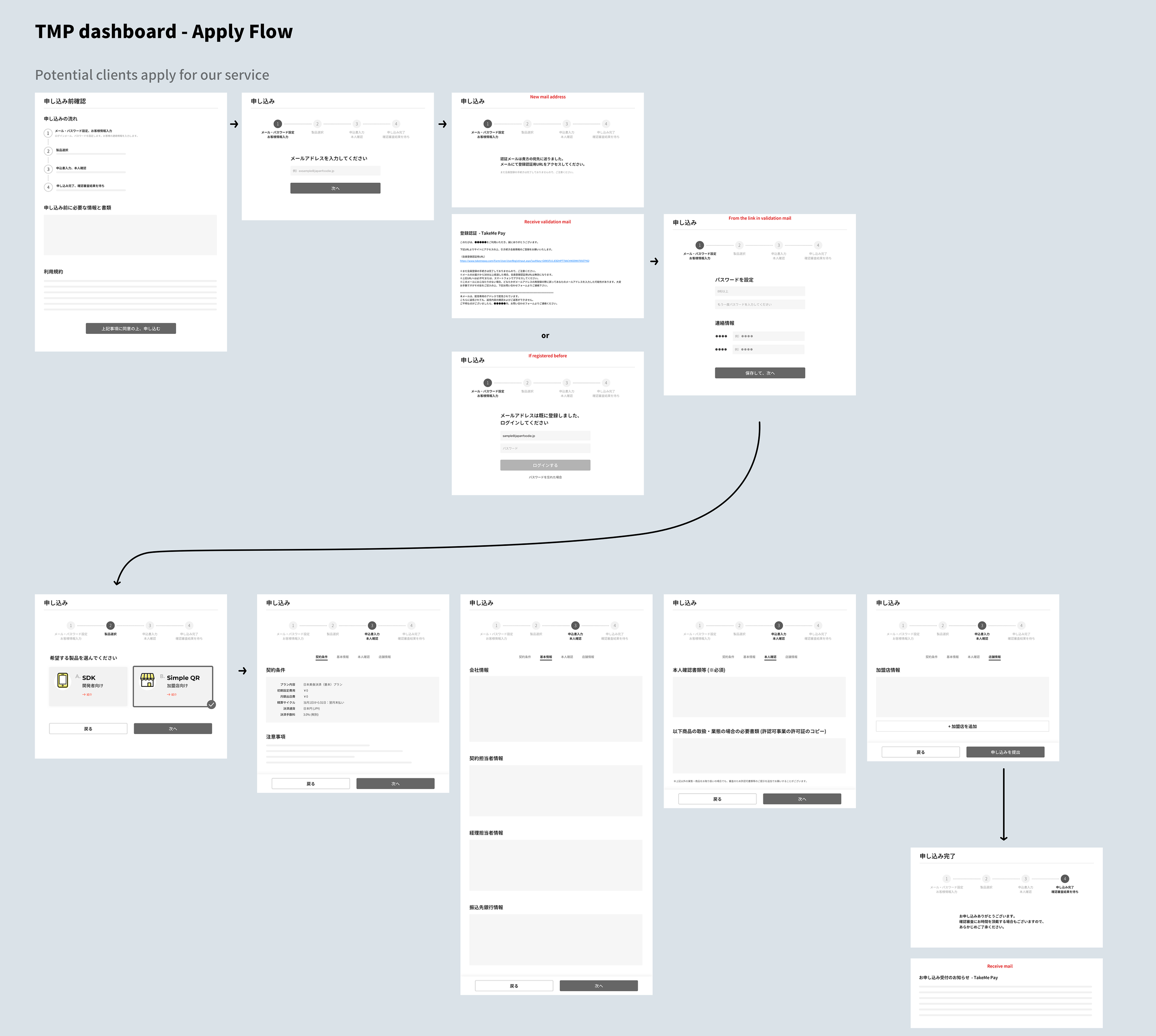
The early sketches of the detailed flow of applying online.
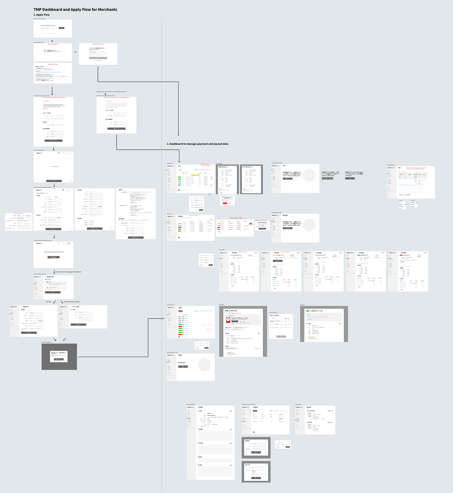
The sketches of how the information in an online application creates the merchant and the payment data in the dashboard system.
The Hypothesis Was Proven Incorrect
After sketching the user flows and outlining the proposed dashboard architecture, I presented the concept to sales and engineering team members. Through these discussions, I realized an important insight:
A redesigned, modern dashboard is a "nice to have"—but not a core reason merchants choose our payment solution.
Two Major Risks Emerged:
Misalignment Between User Goals and Business Goals
Our business users were generally satisfied with the current system and didn’t prioritize improved usability or aesthetics. Their decisions were more influenced by the overall value of our payment solution—such as lower transaction fees and ease of use compared to competitors like PayPay—rather than the dashboard interface.
Scope Complexity
Engineers estimated it would take over a year to implement the redesigned system. Given the scale, we realized the need to break the project into smaller, more manageable goals and focus on delivering a minimum viable product (MVP) first.
Pivot
Since none of the four main features were deemed urgent, we decided to pause the project. Instead, we shifted focus to a new initiative aimed at improving the payment experience from the shop staff’s perspective, where we saw more immediate impact potential.
Key Takeaways
Break large projects into smaller ones—each with a single goal
Trying to address multiple user roles and scenarios in one project made it difficult to define success or manage progress.
Align business goals with user goals
Projects that only serve internal objectives won’t succeed unless they also deliver clear benefits to end users. If users don’t benefit, the project likely shouldn’t be pursued.
Use system rebuilds as redesign opportunities—but start with an MVP
Major system overhauls are a chance to rethink UX, but it’s still critical to start small. Aim for a focused feature set, test early, and iterate. If a rebuild takes a year, ask whether it’s really necessary.
Understand users’ underlying goals, not just their product usage
Some users check sales data in our system; others don’t. Their goal isn’t to use our dashboard—it’s to ensure daily sales are accurate. The product is just one tool in a larger business workflow. Always consider the broader context of their goals.