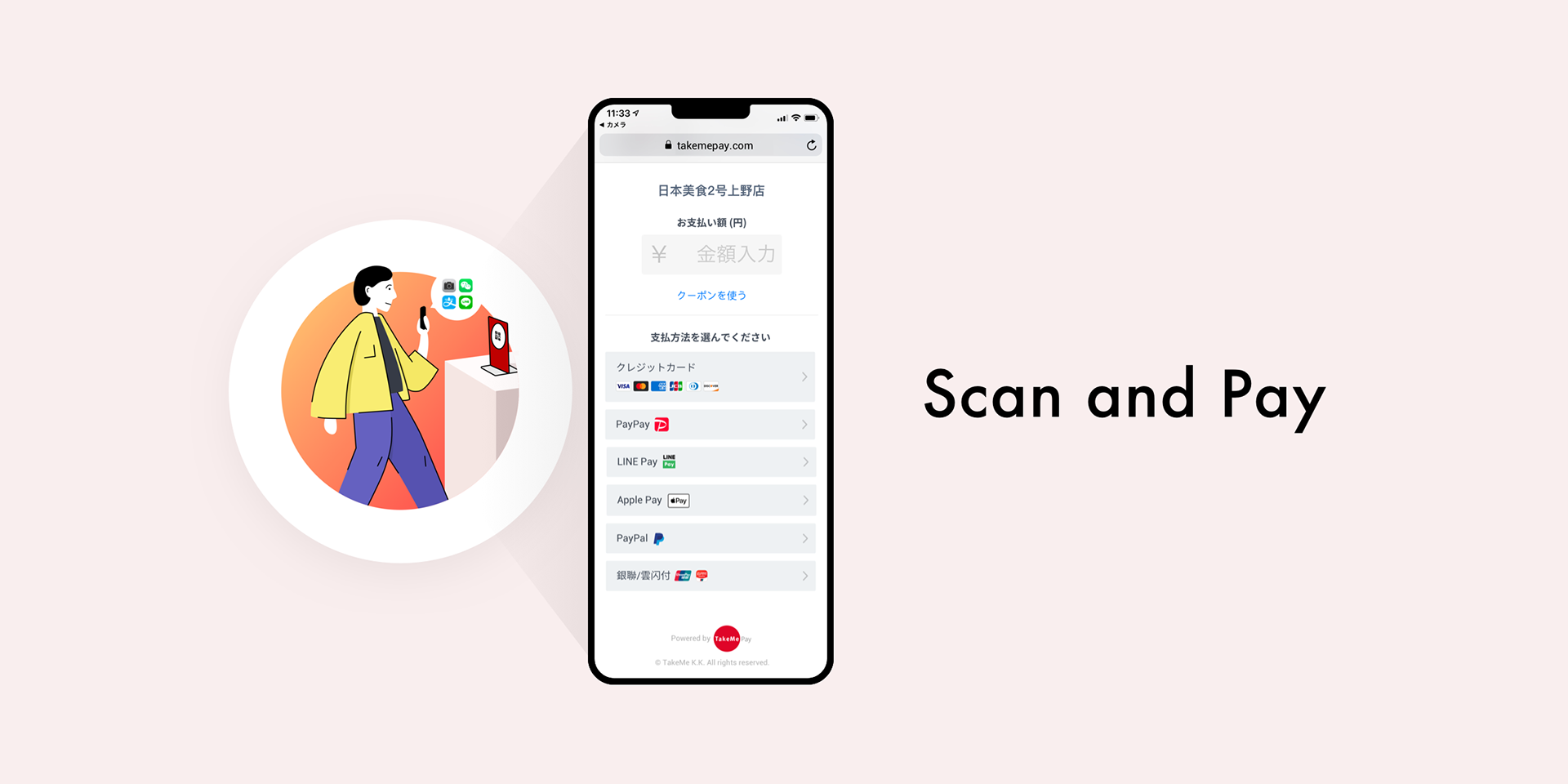
Scan and Pay
How might we guide restaurant customers to pay using the payment tool placed in the restaurant without teaching them?
2019, Japan
Introduction
This project was for TakeMe Pay, a B2B service that provides tools for merchants in Japan to accept various payment methods, both online and in-store, from domestic customers and international travelers alike.
The primary use case for TakeMe Pay is in-store payments. Shops place plastic stands displaying a QR code at the cashier counter or on dining tables. When customers are ready to pay, they scan the QR code, enter the payment amount, select a payment method, and complete the transaction.
However, the existing design had significant usability issues. We discovered that many customers were often confused during the payment process, requiring assistance from store staff. This project aimed to identify those usability problems and redesign the payment interface to ensure a smoother, more intuitive experience, even for first-time users.
I was the sole designer on this project. Although the design phase was completed quickly, implementation was delayed due to various technical challenges. The updated version was released about a year after I left the company, so I don’t have sufficient data to evaluate its full impact.
This case study focuses on the design process and the decisions I made along the way.
Research & Problem Framing
As mentioned in my previous case study, "Lessons Learned from Designing a Complex System," I conducted extensive user research on our business user roles and workflows. From this research, I uncovered several key insights, especially about the challenges unique to B2B product design.
Key Research Findings:
In B2B services, the person who decides to adopt the product is often not the same person who actually uses it.
This is a fundamental difference from B2C services. It means we need to consider and design for multiple types of users, with different motivations, knowledge levels, and onboarding needs.Compared to my past experiences in China, I found that many merchant staff in Japan had limited experience with mobile payment systems.
In 2019, many had never used PayPay or LINE Pay themselves. Their unfamiliarity with digital payments impacted both their confidence and willingness to adopt new tools.Merchants were open to paying for services—but only when they could clearly see the benefits.
For example, many restaurants paid high monthly fees to platforms like Tabelog and HOT PEPPER because they saw the value in attracting more customers.
However, they often saw payment transaction fees (3.0%+) as a cost, not a benefit. Many merchants only joined our service during promotional periods when we offered 0% transaction fees.Some restaurants refused to accept digital payments during peak hours, such as lunchtime, because they believed cashless payment was slower and caused customer queues to grow longer.
A few forward-thinking restaurant managers were considering new pickup models where customers could order and pay online in advance, improving overall efficiency and reducing wait times.
Framing the Problem
After analyzing the research, I narrowed the focus to the most pressing challenge—one that could be solved through design:
“Customers from all over the world visit these restaurants. At the cashier, the payment process takes too long, causing queues and lowering operational efficiency.”
お店にいるのは、日本人だけでなく、全世界からのお客様である。レジで決済を行う時に時間がかかるので、後ろのお客様が待っている。これにより、運営効率の低下は課題となる。
Proposed Solution
To address the inefficiency at the cashier and reduce wait times, I proposed a redesigned in-store payment UI based on two key principles:
Shift the main payment scenario from cashier-based to table-based
Allow customers to pay directly at their table or seat, removing the need to stand in line.Simplify the UI based on the user’s language
Customize the payment screen for users in Japanese, English, or Chinese, so international customers can understand and complete the payment with ease.Reduce the number of payment steps
Streamline the user flow to make the experience faster and more intuitive.
1) レジ決済の代わりに、テーブル決済をメーンのシーンとする。
2) 日本語と中国語と英語のお客様を分けて、お支払い画面UIを改善。
3) お支払いのステップ数を減らし、流れを改善。
Design Overview
Here’s what the redesign focused on:
A cleaner, more intuitive UI for the payment screen, removing unnecessary elements and minimizing decision fatigue.
Language-specific UIs, triggered based on system language or user selection, to reduce confusion for foreign tourists.
A more efficient payment flow, designed with fewer steps and less manual input, optimized for both new and returning users.
By allowing customers to pay at their seats and simplifying the experience, we addressed the core issue of operational inefficiency while improving overall user satisfaction.
User Story
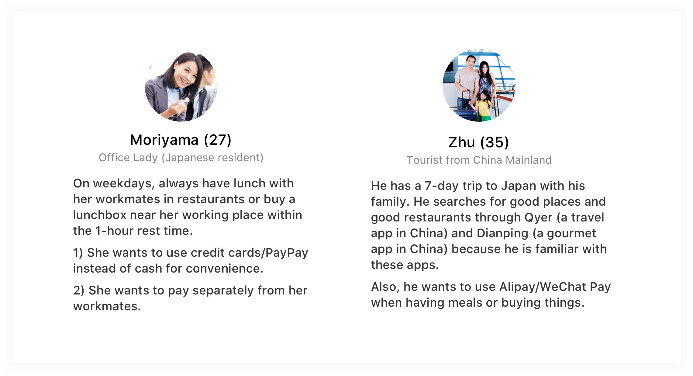
We identified our two primary customer user roles as:
Japanese locals, who use the interface in Japanese.
Mandarin-speaking tourists, mainly from mainland China and Taiwan.
Tourists from other countries will be shown the English interface if their device language is set to English.
Payment method preferences vary significantly across these groups:
Japan: PayPay, Line Pay, credit cards.
China: WeChat Pay, Alipay, UnionPay.
Others: Visa, MasterCard, Apple Pay, etc.
To support this variety, the UI must adapt to both language and preferred payment methods while remaining fast and intuitive, especially in busy in-store situations.
Analysis of the Previous Design
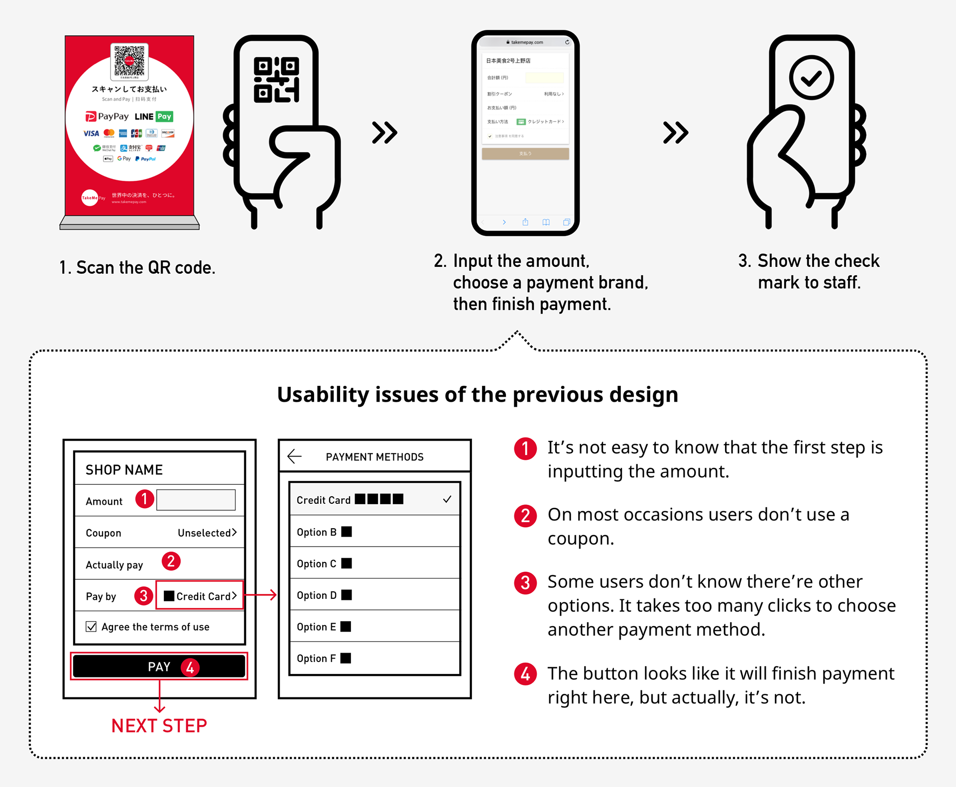
Existing User Flow (Before Redesign):
Scan the QR code.
Tap the amount input area.
Manually input the payment amount.
Tap to open the payment method selector (which navigates to a new page).
Select a payment method from a long list (then return to the previous screen).
Tap the “Pay” button to proceed to the external payment gateway (e.g., PayPay, credit card, etc.).
Once the payment is completed, a checkmark screen appears. The user must show this to the shop staff.
Key Usability Issues:
❶ Lack of clear guidance: Users often didn’t realize the first step was entering the amount.
❷ Coupon-related confusion: Most users didn’t use coupons, yet the coupon field appeared prominently, creating unnecessary friction.
❸ Too many clicks for payment selection: Choosing a payment method required an additional page and navigation steps, which some users didn’t even notice.
❹ Misleading CTA: The “Pay” button looked like it would complete the payment on tap, but it only moved users to the next step (external payment gateway), causing confusion.
Redesign Strategy
Key Improvements:
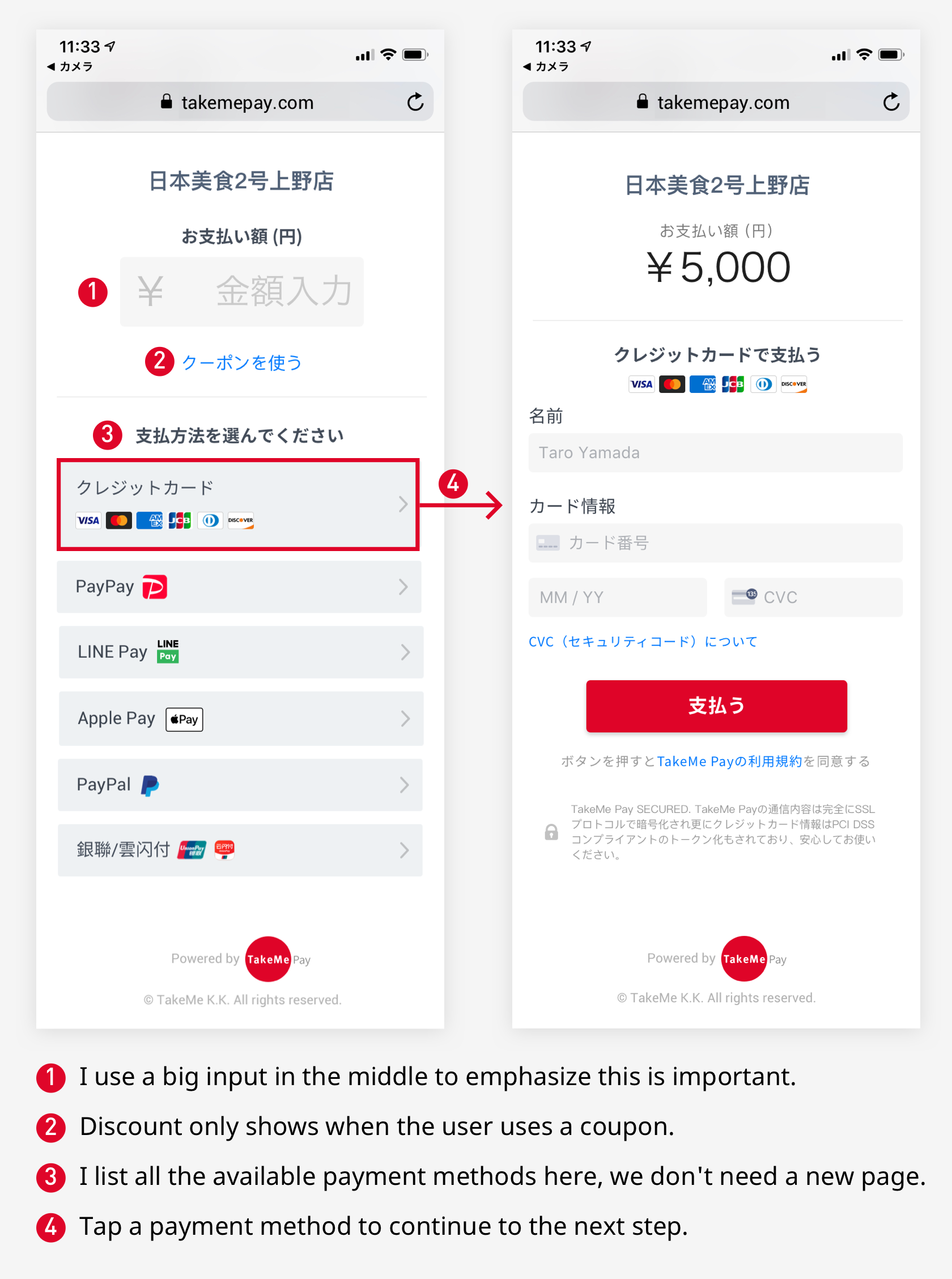
❶ More intuitive amount input
The input field is now prominently centered on the screen, visually signaling its importance as the first step.
❷ Contextual display of discounts
The discount field only appears if the user is actually applying a coupon, removing distractions for the majority who don’t.
❸ All payment methods on one screen
Payment methods are now displayed in-line, eliminating the need to navigate to another page to make a selection.
❹ Clear next-step flow
Tapping a payment method takes the user directly to the external payment screen, aligning the UI with user expectations.
Updated User Flow (After Redesign):
Scan the QR code.
Tap the amount input area.
Input the amount.
Tap a preferred payment method (from a visible list) to proceed to its payment page.
After successful payment, a checkmark screen is displayed for confirmation, users show this to shop staff.
Reduced from 7 steps to 5, with improved clarity and fewer clicks.
Use cases
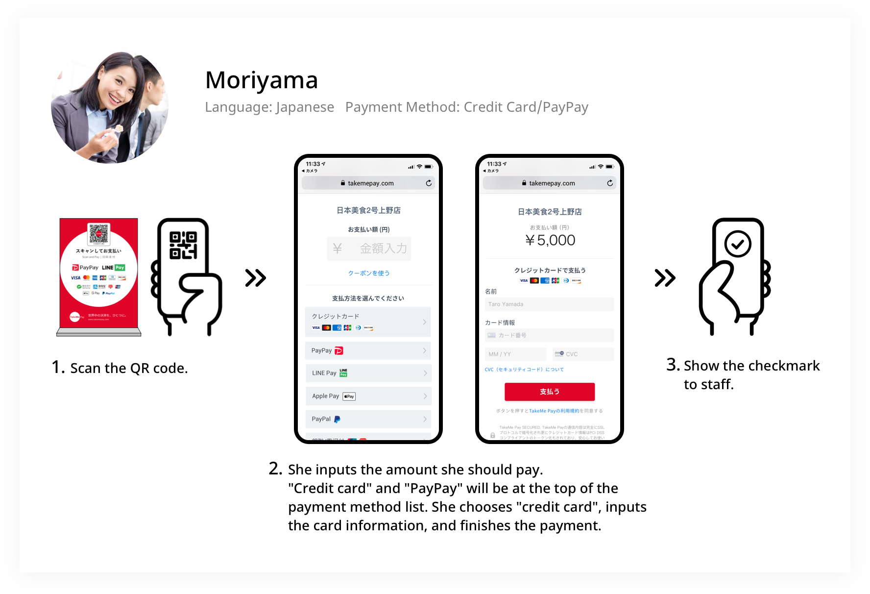
Japanese Office Worker (OL) Case
Scenario:
A Japanese office worker uses her iPhone to make a payment at a restaurant.
Flow:
She opens the iPhone camera and scans the QR code placed on the dining table. The payment page opens automatically in Safari.
She enters the payment amount as displayed on the bill. The UI displays the most relevant payment methods at the top—"Credit Card" and "PayPay", based on her past usage and local popularity.
She taps "Credit Card", enters her card details, and confirms the payment. After the payment is completed, a checkmark screen is displayed.
She shows the checkmark to the shop staff, confirming the transaction is successful.
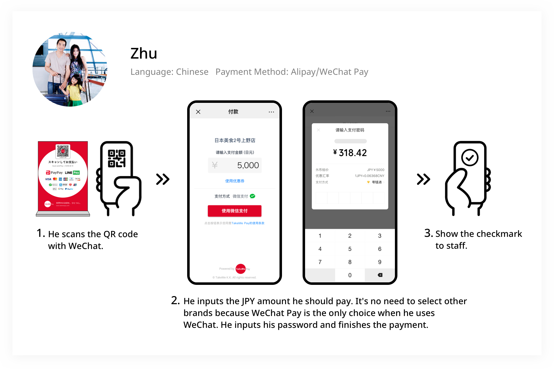
Chinese Tourist Case
Scenario:
A tourist from China wants to pay at a restaurant using WeChat Pay.
Flow:
He opens WeChat and uses the built-in scanner to scan the restaurant’s QR code. The payment page opens directly within WeChat’s built-in browser.
He enters the amount in Japanese Yen (JPY) shown on the bill. Since the QR code was scanned via WeChat, the system automatically recognizes the context and shows WeChat Pay as the only available option—no need to choose a payment method.
He confirms the payment by entering his WeChat Pay password. Once the payment is completed, a checkmark screen appears.
He shows the checkmark to the shop staff to confirm the transaction.
Impact of the Redesign
Qualitative Outcomes
By reducing the number of steps in the payment flow and introducing localization based on the user’s device language and the QR code scanner app (e.g., WeChat or browser), we significantly improved the overall usability of the system.
Key improvements:
Simplified user journey led to faster payments and fewer errors.
Localized UI helped both Japanese users and international tourists feel more confident navigating the interface.
Clear payment method selection reduced confusion and unnecessary navigation, particularly for users unfamiliar with mobile payment systems.
Opportunities for Further Improvement
We identified additional areas to enhance user experience through personalization:
Smart ordering of payment methods: By dynamically reordering the list of payment methods based on user language or region, we can surface the most popular options (e.g., PayPay in Japanese UI, Alipay/WeChat Pay in Chinese UI).
Preference-based suggestions: Reordering based on past usage or device settings could further streamline the process.
Another Concept: Seamless Integration with POS (Cash Register) Systems
We hypothesized that eliminating the manual input of payment amounts could further increase the conversion rate and reduce human error.
Concept:
Automatically link the QR code with the restaurant's POS system, so that when a customer scans the QR code, the payment amount is already filled in.
Implementation:
Our engineering team developed a prototype integration with a cash register system and deployed it in a live restaurant environment.
The system worked successfully:
The payment page pre-filled the amount.
Staff no longer needed to verbally tell the customer the amount.
Fewer mistakes and faster transactions were reported.
The shop manager expressed high satisfaction, seeing it as a valuable operational improvement.
Challenges and Next Steps:
Technical hurdles remained, particularly in supporting multiple cash register brands with different specifications.
Despite the complexity, the entire team recognized this as a high-potential direction and agreed to pursue further development.
Note: The project was released one year after I left the company, so I didn't have enough data to show the change.